Scatter plots are commonly used in medicine to illustrate the relation between two continuous variables. However, scatter plots can also be used to show discrete numeral and ordinal data.
Download the anscombe.rda dataset for this example1.
Anscombe’s fictional data sets can be shown by:
anscombe.quartet
   X1    Y1 X2   Y2 X3    Y3 X4    Y4
1  10  8.04 10 9.14 10  7.46  8  6.58
2   8  6.95  8 8.14  8  6.77  8  5.76
3  13  7.58 13 8.74 13 12.74  8  7.71
4   9  8.81  9 8.77  9  7.11  8  8.84
5  11  8.33 11 9.26 11  7.81  8  8.47
6  14  9.96 14 8.10 14  8.84  8  7.04
7   6  7.24  6 6.13  6  6.08  8  5.25
8   4  4.26  4 3.10  4  5.39 19 12.50
9  12 10.84 12 9.13 12  8.15  8  5.56
10  7  4.82  7 7.26  7  6.42  8  7.91
11  5  5.68  5 4.74  5  5.73  8  6.89
The four data sets are x1 vs y1, x2 vs y2, x3 vs y3 and x4 vs y4. The x and y variables have identical means:
summary(anscombe.quartet$X1)
   Min. 1st Qu.  Median    Mean 3rd Qu.    Max.
    4.0     6.5     9.0     9.0    11.5    14.0
summary(anscombe.quartet$X2)
   Min. 1st Qu.  Median    Mean 3rd Qu.    Max.
    4.0     6.5     9.0     9.0    11.5    14.0
summary(anscombe.quartet$X3)
   Min. 1st Qu.  Median    Mean 3rd Qu.    Max.
    4.0     6.5     9.0     9.0    11.5    14.0
summary(anscombe.quartet$X4)
   Min. 1st Qu.  Median    Mean 3rd Qu.    Max.
      8       8       8       9       8      19
summary(anscombe.quartet$Y1)
   Min. 1st Qu.  Median    Mean 3rd Qu.    Max.
  4.260   6.315   7.580   7.501   8.570  10.840
summary(anscombe.quartet$Y2)
   Min. 1st Qu.  Median    Mean 3rd Qu.    Max.
  3.100   6.695   8.140   7.501   8.950   9.260
summary(anscombe.quartet$Y3)
   Min. 1st Qu.  Median    Mean 3rd Qu.    Max.
   5.39    6.25    7.11    7.50    7.98   12.74
summary(anscombe.quartet$Y4)
   Min. 1st Qu.  Median    Mean 3rd Qu.    Max.
  5.250   6.170   7.040   7.501   8.190  12.500
and standard deviations:
sd(anscombe.quartet$X1)
[1] 3.316625
sd(anscombe.quartet$X2)
[1] 3.316625
sd(anscombe.quartet$X3)
[1] 3.316625
sd(anscombe.quartet$X4)
[1] 3.316625
sd(anscombe.quartet$Y1)
[1] 2.031568
sd(anscombe.quartet$Y2)
[1] 2.031657
sd(anscombe.quartet$Y3)
[1] 2.030424
sd(anscombe.quartet$Y4)
[1] 2.030579
It is important to plot data, rather than solely relying on descriptive parameters, so that their relation can be appreciated. To plot the first data set:
ggplot(data=anscombe.quartet, aes(x = X1, y = Y1)) +
geom_point() +
ggtitle(label = 'Anscombe\'s First Data Set') +
theme_bw()
The backslash \ before the ‘s is required so the quotation mark does not indicate the end of the title’s text string, but that the quotation mark is part of the title.
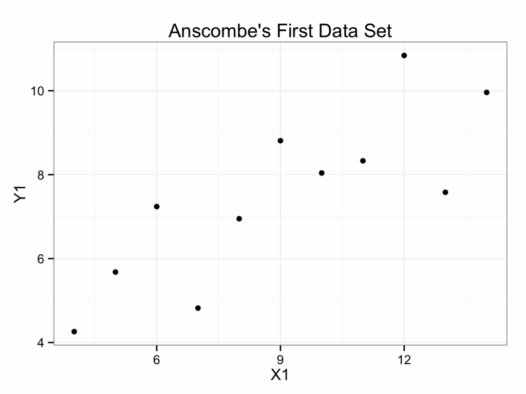
It is customary to put the independent (explanatory or predictor) variable on the x-axis (abscissa) and the dependent (response or outcome) variable on the y-axis (ordinate). However, it is not always clear which variable is dependent and which independent.
The second data set:
ggplot(data=anscombe.quartet, aes(x = X2, y = Y2)) +
geom_point() +
ggtitle(label = 'Anscombe\'s Second Data Set') +
theme_bw()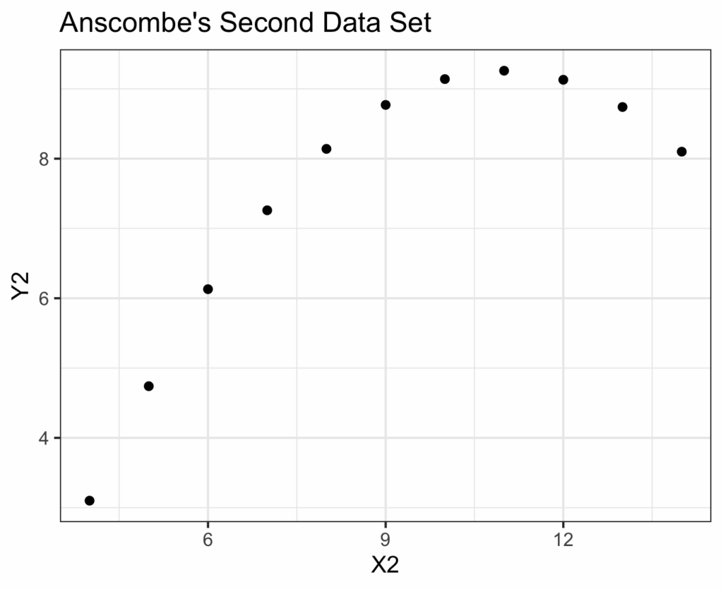
The third data set:
ggplot(data=anscombe.quartet, aes(x = X3, y = Y3)) +
geom_point() +
ggtitle(label = 'Anscombe\'s Third Data Set') +
theme_bw()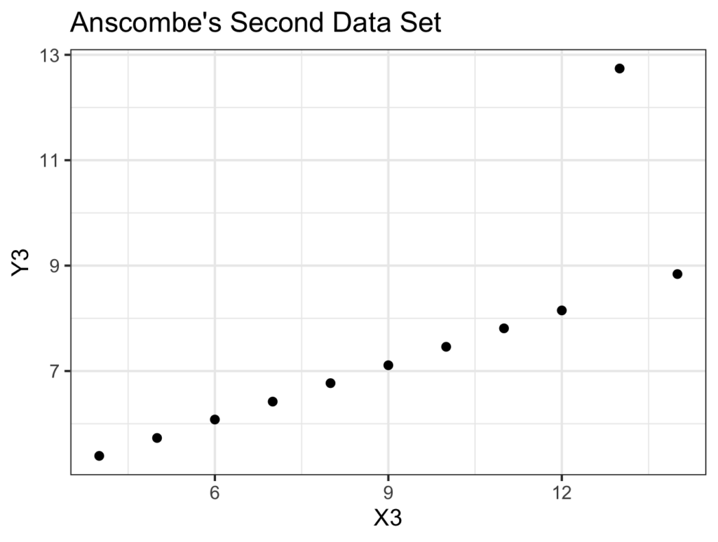
And the fourth data set:
ggplot(data=anscombe.quartet, aes(x = X4, y = Y4)) +
geom_point() +
ggtitle(label = 'Anscombe\'s Fourth Data Set') +
theme_bw()
This illustrates the importance of plotting your data.