Essentially, a regression plot is a scatter plot with a fitted regression line. Regression lines could be linear, quadratic, and polynomial amongst others. The example below demonstrates how to create a linear regression plot for Anscombe’s first data set. Download the anscombe.rda dataset for this example1.
Create a scatterplot as discussed:
Anscombe’s fictional data sets can be shown by:
anscombe.quartet
   X1    Y1 X2   Y2 X3    Y3 X4    Y4
1  10  8.04 10 9.14 10  7.46  8  6.58
2   8  6.95  8 8.14  8  6.77  8  5.76
3  13  7.58 13 8.74 13 12.74  8  7.71
4   9  8.81  9 8.77  9  7.11  8  8.84
5  11  8.33 11 9.26 11  7.81  8  8.47
6  14  9.96 14 8.10 14  8.84  8  7.04
7   6  7.24  6 6.13  6  6.08  8  5.25
8   4  4.26  4 3.10  4  5.39 19 12.50
9  12 10.84 12 9.13 12  8.15  8  5.56
10  7  4.82  7 7.26  7  6.42  8  7.91
11  5  5.68  5 4.74  5  5.73  8  6.89
The first data set has X1 on the x -axis and Y1 on the y-axis. To create a scatterplot:
regressionplot <- ggplot(data=anscombe.quartet, aes(x = X1,y = Y1)) +
geom_point() +
ggtitle(label = "Anscombe \'s First Data Set") +
theme_bw()
The backslash \ before the ‘s is required so the quotation mark does not indicate the end of the title’s text string, but that the quotation mark is part of the title!
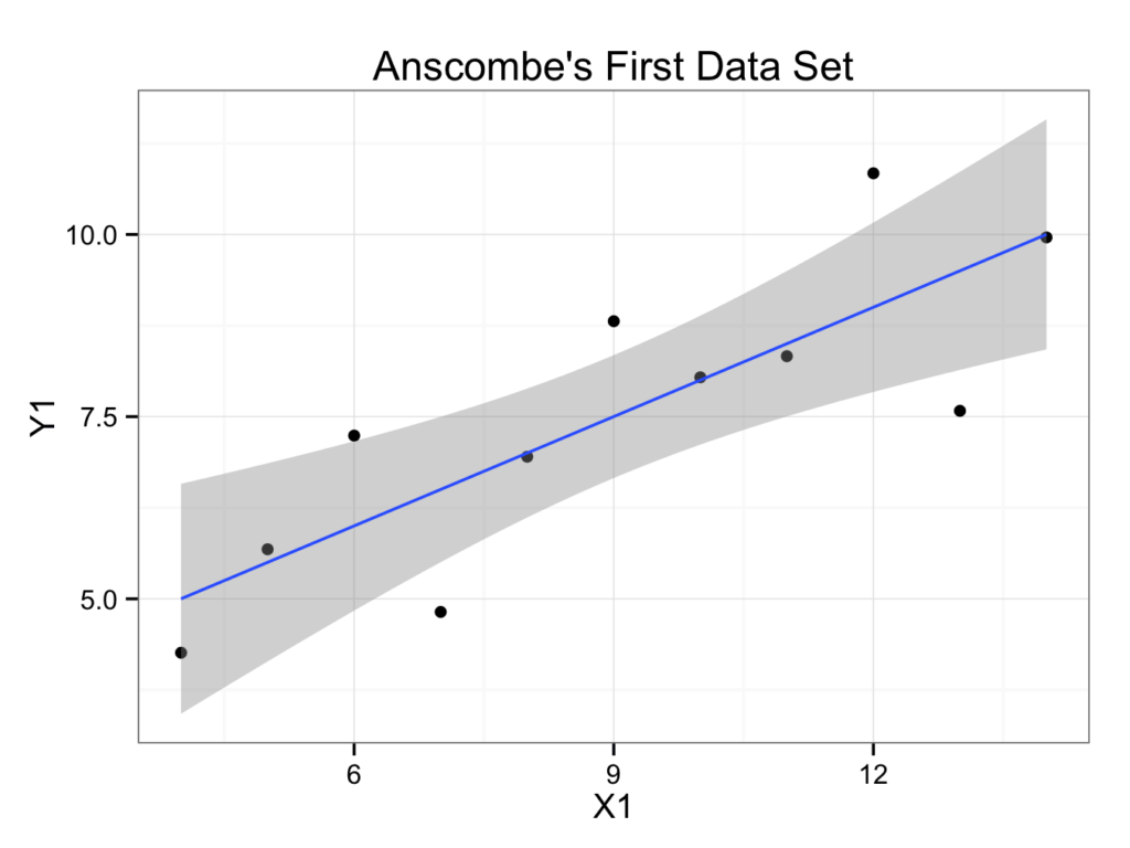
To add a regression line with a 95% confidence interval:
regressionplot <- regressionplot +
geom_smooth(aes(x=X1, y=Y1), data=anscombe.quartet, method = 'lm')
regressionplot
Will show the plot:
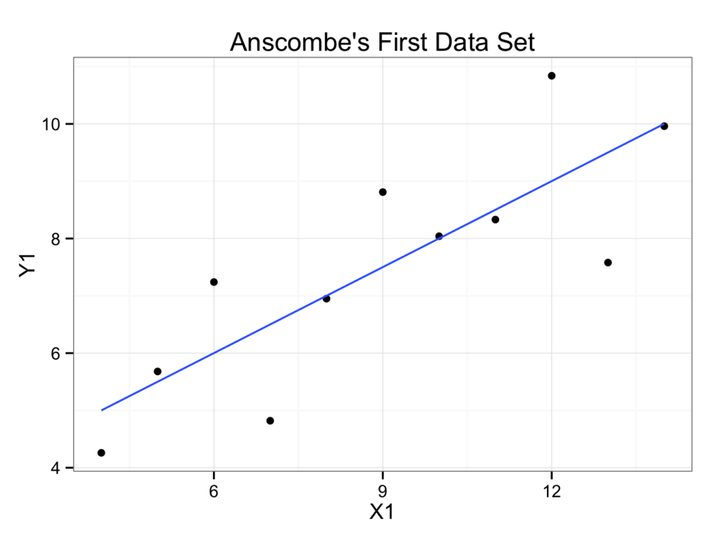
Or without a 95% confidence interval:
regressionplot2 <- ggplot(data=anscombe.quartet, aes(x = X1,y = Y1)) +
geom_point() +
geom_smooth(method = 'lm', se = FALSE) +
ggtitle(label = "Anscombe \'s First Data Set") +
theme_bw()
regressionplot2
Will show the plot:
It is customary to put the independent (explanatory or predictor) variable on the x-axis (abscissa) and the dependent (response or outcome) variable on the y-axis (ordinate). However, it is not always clear which variable is dependent and which independent.