Prevalence, positive and negative predictive value change with different values for alpha (significance level) and beta (probability of making a type 2 error, 1 – power). This is illustrated below.
First, define functions to calculate the positive and negative predictive value:
# define functions

ppv = function(alpha = NA, beta = NA, prevalence = NA){
	result = (1-beta)*prevalence / ((1-beta)*prevalence + alpha*(1-prevalence))
	return(result)
}

npv = function(alpha = NA, beta = NA, prevalence = NA){
	result = (1-alpha)*(1-prevalence) / ( (1-alpha)*(1-prevalence) + beta*(prevalence))
	return(result)
}
Create a data frame with values:
# create dataframe with variable prevalence, alpha and beta
prevalence = rep(c(0.1, 0.3, 0.5, 0.7, 0.9), 9)
alpha = rep(c(rep(0.001,5), rep(0.01, 5), rep(0.05,5)), 3)
beta = c(rep(0.2, 15), rep(0.5, 15), rep(0.8, 15))

df = data.frame(prevalence, alpha, beta)
df$power = 1-df$beta
df$PPV = ppv(alpha=df$alpha, beta=df$beta, prevalence=df$prevalence)
df$NPV = npv(alpha=df$alpha, beta=df$beta, prevalence=df$prevalence)
head(df)
  prevalence alpha beta power       PPV       NPV
1        0.1 0.001  0.2   0.8 0.9888752 0.9782396
2        0.3 0.001  0.2   0.8 0.9970918 0.9209798
3        0.5 0.001  0.2   0.8 0.9987516 0.8331943
4        0.7 0.001  0.2   0.8 0.9994646 0.6816011
5        0.9 0.001  0.2   0.8 0.9998611 0.3569132
6        0.1 0.010  0.2   0.8 0.8988764 0.9780461
Convert to long format
# convert to long format:
df_long = pivot_longer(df, cols = c(PPV, NPV), names_to = 'rate', values_to = 'value')
df_long $rate = as.factor(df_long $rate)
df_long
# A tibble: 90 × 6
   prevalence alpha  beta power rate  value
        <dbl> <dbl> <dbl> <dbl> <fct> <dbl>
 1        0.1 0.001   0.2   0.8 PPV   0.989
 2        0.1 0.001   0.2   0.8 NPV   0.978
 3        0.3 0.001   0.2   0.8 PPV   0.997
 4        0.3 0.001   0.2   0.8 NPV   0.921
 5        0.5 0.001   0.2   0.8 PPV   0.999
 6        0.5 0.001   0.2   0.8 NPV   0.833
 7        0.7 0.001   0.2   0.8 PPV   0.999
 8        0.7 0.001   0.2   0.8 NPV   0.682
 9        0.9 0.001   0.2   0.8 PPV   1.00
10        0.9 0.001   0.2   0.8 NPV   0.357
# ℹ 80 more rows
# ℹ Use `print(n = ...)` to see more rows
Show the plot:
df_long %>%
	ggplot(aes(x=prevalence, y=value, colour=rate, shape=as.factor(beta))) +
	geom_line() +
	geom_hline(yintercept = 0.8, colour = 'steelblue', linetype = 'dashed', alpha = 0.5) +
	facet_grid(alpha ~ beta, labeller = label_both) +
	theme_bw() +
	scale_x_continuous('Prevalence') +
	scale_y_continuous('Value') +
	scale_colour_manual(values = c("tomato", "olivedrab"), name = "") +
	ggtitle("PPV and NPV for different values of alpha and beta")
ggsave('/path_to_file/ppv_npv_plot.jpg')
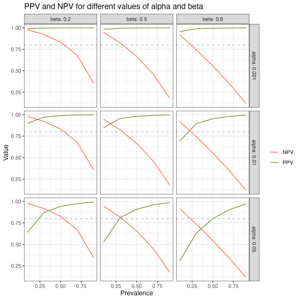
The dotted blue line indicates 80% power