A mosaic plot is used to evaluate several categorical variables into one plot and are a way of displaying contingency tables graphically. The width and heights of individual cells represent their proportions of total. In each individual column, the width on the box is the same and is equal to the total count of that column. The height of each cell represents the proportion of patients in that column. In fact, each column in a mosaic plot represents a bar plot with the bins stacked on top of each other. Each cell in the mosaic plot represents the proportion of that combination of categories to the total and is just a graphical display of a contingency table.
To create a mosaic plot, the vcd (visualise categorical data) package1 could be used. The example below shows how to create a mosaic plot using the Titanic data set included in R.
library(vcd)
Loading required package: grid
Titanic
, , Age = Child, Survived = No

      Sex
Class  Male Female
  1st     0      0
  2nd     0      0
  3rd    35     17
  Crew    0      0

, , Age = Adult, Survived = No

      Sex
Class  Male Female
  1st   118      4
  2nd   154     13
  3rd   387     89
  Crew  670      3

, , Age = Child, Survived = Yes

      Sex
Class  Male Female
  1st     5      1
  2nd    11     13
  3rd    13     14
  Crew    0      0

, , Age = Adult, Survived = Yes

      Sex
Class  Male Female
  1st    57    140
  2nd    14     80
  3rd    75     76
  Crew  192     20
Please note the data is in a contingency table format (not a data frame) required for the mosaic function of the vcd package.
To convert data to a contingency table, use the table function in R base package.
mosaic(Titanic)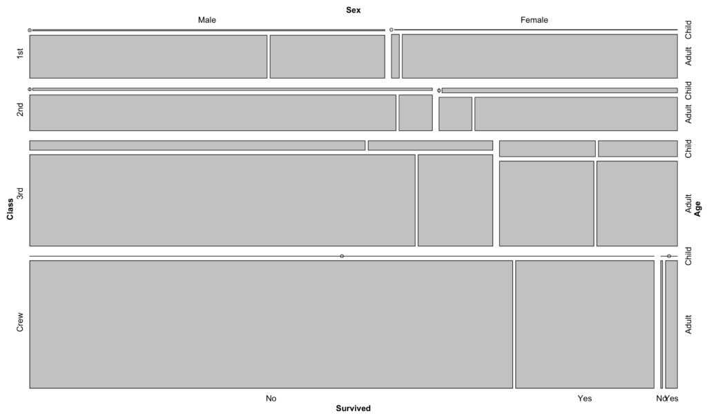
The real strength of a mosaic plot is that it is possible to display the residuals of a chi-square test graphically by applying shading to the different categories according the the value of their residual (Pearson). In fact it is a graphical display of a chi-square test. To obtain such a plot, just set the shading argument to TRUE:
mosaic(Titanic, shade = TRUE)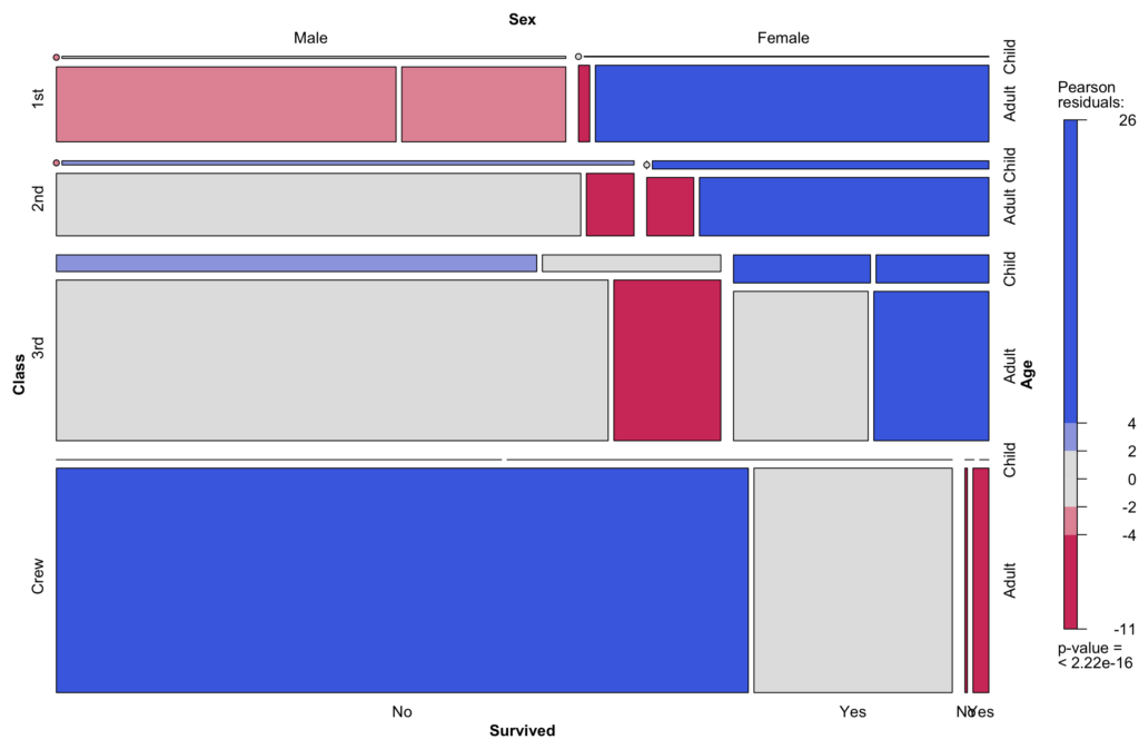
It is now very easy to see which categories are under-represented (red) and over-represented (blue).
In addition, it is possible to create custom mosaic plots with ggplot2. An example function for two categorical variables can be downloaded here. Please note that the function requires three arguments: data frame, variable1 and variable2.
For example, copy and paste the function into R and create a mosaic plot with the mtcars dataset:
mosaicGG(mtcars,'cyl','am')

     4  6  8
  0  3  4 12
  1  8  3  2

	Pearson's Chi-squared test

data:  table(data[[FILL]], data[[X]])
X-squared = 8.7407, df = 2, p-value = 0.01265

  FILL X    residual
1    0 4 -1.38175267
2    1 4  1.67045752
3    0 6 -0.07664242
4    1 6  0.09265616
5    0 8  1.27898721
6    1 8 -1.54622013
Warning message:
In chisq.test(table(data[[FILL]], data[[X]])) :
  Chi-squared approximation may be incorrect
The expected frequencies are less than 5, hence the warning message.
The resulting plot:
Or as PDF: