There are two types of funnel plot used in the scientific literature. One is used to check for the presence of publication bias in a meta-analysis. The other is used to compare institutional performance.
Funnelplot to check for publication bias1:
Download the plottranexamic.rda dataset for this example2
http://www.bmj.com/content/344/bmj.e30543
The data frame is called tranexamic and contains the details of 87 studies included in the meta-analysis. The data can be seen by entering:
tranexamicoutput omitted for brevity
The variables are: Trial (authors and date of the trial), TxE (number of events in the treatment group), TxN (number of observations in the treatment group), ControlE (number of events in the control group) and ControlN (number of observations in the control group).
To create a funnel plot the meta package4 should be installed. To perform meta-analysis, using the fixed and random effects models, showing the odds ratio:
library(meta)
metatranexamic<-metabin(TxE,TxN,ControlE,ControlN,data=tranexamic,sm="OR")
To show the details of the analysis:
metatranexamic
Number of studies: k = 87
Number of observations: o = 8110 (o.e = 4209, o.c = 3901)
Number of events: e = 2505

                         OR           95%-CI      z  p-value
Common effect model  0.4113 [0.3679; 0.4597] -15.64 < 0.0001
Random effects model 0.4016 [0.3388; 0.4759] -10.52 < 0.0001

Quantifying heterogeneity (with 95%-CIs):
 tau^2 = 0.2344 [0.1218; 0.6578]; tau = 0.4841 [0.3490; 0.8111]
 I^2 = 43.2% [26.6%; 56.0%]; H = 1.33 [1.17; 1.51]

Test of heterogeneity:
      Q d.f.  p-value
 151.31   86 < 0.0001

Details of meta-analysis methods:
- Mantel-Haenszel method (common effect model)
- Inverse variance method (random effects model)
- Restricted maximum-likelihood estimator for tau^2
- Q-Profile method for confidence interval of tau^2 and tau
- Calculation of I^2 based on Q
- Continuity correction of 0.5 in studies with zero cell frequencies
Both, the fixed and random effects model show a significantly different odds ratio (p<0.0001). When different studies show different results, this can be due to chance (study homogeneity) or genuine differences (study heterogeneity). The value of I squared5 shows moderate heterogeneity (44%) with a significant p value.
To show the funnel plot with an appropriate title:
funnel(metatranexamic)
title(main='Meta Analysis Tranexamic Acid')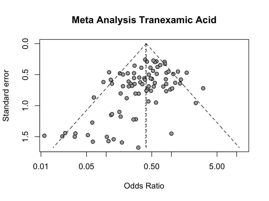
The plot shows an an overall odds ratio of approximately 0.5, favouring treatment with tranexamic acid.
Please note that the vertical axis has a reverse scale, so the larger studies (with a smaller standard error) are on the top of the graph and the smaller studies are at the bottom of the graph. The odds ratio scale (horizontal) is logarithmic. An odds ratio of less than 1.0 indicates a positive (less bleeding) effect of tranexamic acid and an odds ratio larger than 1.0 suggests no effect. Without publication bias, the plot is pyramid shaped. A skewed plot indicates publication bias. In this plot, there are equal number of larger studies with a positive or negative effect. However, all smaller studies (lower part of the plot) show a positive effect (OR < 1) of tranexamic acid (there are no studies in the lower (right) part that have an odds ratio > 1.0). This indicates publication bias of smaller studies; only smaller studies that showed a positive effect of tranexamic acid were published.
Funnelplot to compare institutional performance67:
A different type of funnel plot can be used to compare institutional or surgical performance. The National Joint Registry 8 has used these plots to show differences in standardised mortality rate between surgeons and institutions.
Download the plotfunnelhip.rda dataset for this example. To create this type of funnel plot, the package ‘berryFunctions’ 9 should be installed.
library(berryFunctions)The data frame is called plotfunnelhip and has the variables: surgeon, cases (number of cases) and revisions (number of revisions). To show the data frame:
plotfunnelhip
   surgeon cases revisions
1        1    49        15
2        2     9         3
3        3   128         8
4        4    53         3
5        5   321        24
6        6   256        26
7        7   125         9
8        8    51         5
9        9    48         6
10      10    60         5
To create the funnel plot:
funnelPlot(plotfunnelhip$revisions, plotfunnelhip$cases, xlab='Number of Hip Replacements', ylab='Percentage Revisions (%)', main='Funnel Plot THR') 
The horizontal orange line indicates the mean number of revisions (13%). The ‘funnel’ is created by the confidence intervals as indicated. The more procedures a surgeon does, the smaller the standard error (and the narrower the funnel).
In this plot, most (8) surgeons are below the mean. However, two surgeons are well above the mean; one almost two standard deviations and one more than three standard deviations. There may well be a very valid reason why one surgeon has a revision rate more than three standard deviations above the mean, but this would require further evaluation.
To find the mean:
percentage <- 100*plotfunnelhip$revisions/plotfunnelhip$cases
mean(percentage)
[1] 13.13261