
Image from https://www.birdspot.co.uk/culture/storks-and-the-delivery-of-babies
According to European folklore, the white stork (Ciconia ciconia) delivers new babies to parents. The story was popularised by Hans Christian Anderson:
“Stork, stork, fly away;
Stand not on one leg to-day.
Thy dear wife is in the nest,
Where she rocks her young to rest.
The first he will be hanged,
The second will be hit,
The third he will be shot,
And the fourth put on the spit.”
…..
Now we will fly to the pond, and bring one for each of the children who have not sung the naughty song and laughed at the Storks.”

https://www.birdlife.org/news/2024/03/13/migratory-bird-of-the-month-white-stork
The origins of the myth are probably related to:
- Migration of storks, arriving in the spring when more babies are born
- Monogamous relationship
- Nesting close the humans on high chimneys
Storks migrate to over-winter in sub-Saharan Africa. The routes are shown in the image below:

origin https://en.wikipedia.org/wiki/White_stork#/media/File:WhiteStorkMap.svg
In 2000, Robert Andrews, wrote in Teaching Statistics (10.1111/1467-9639.00013), that there is a ‘highly statistically significant‘ correlation between stork populations and human birth rates across Europe. Although the term ‘highly statistically significant’ is incorrect (the p value refers to the probability the test statistic takes a more extreme value and does not measure the probability the hypothesis is true), it is clearly intended to highlight the danger of confusing correlation with causation (Hill’s criteria).
Let’s examine the question in more detail for The Netherlands with figures available from public sources.
- Population data, including birth rates were downloaded from the Centraal Bureau voor de Statistiek and were saved as rda and csv files
- Stork numbers were obtained from two sources:
- Sovon data from 1930 – 2016
- STichting Ooievaars Research and Knowhow (STORK) data from 1990 – 2025
- Both sources contained a bar chart with number of breeding pairs for each year. The number of breeding pairs were read from the plot using a ruler for accuracy
- Between 1930 and 1990 data were only available from Sovon
- Between 2016 and 2025 data were only available from STORK
- Between 2016 and 1990 data were available from Sovon and STORK. Although similar, the values were not identical and the mean value was taken. The data were saved as rda and csv files
Download the data (csv) and import in R:
library(ggplot2)
library(dplyr)

load('/path_to_file/df_stork.rda')
load('/path_to_file/df_pop_nl.rda')

df_stork
# A tibble: 84 × 2
    year breeding_pairs
   <dbl>          <dbl>
 1  1931           230
 2  1932           275
 3  1933           250
 4  1934           312.
 5  1935           298.
 6  1936           348.
 7  1937           298.
 8  1938           290
 9  1939           318.
10  1940           325
# ℹ 74 more rows
# ℹ Use `print(n = ...)` to see more rows

df_pop_nl
# A tibble: 83 × 8
    year decade population_jan_01 population_dec_31   born born_ratio_per_1000 deaths deaths_ratio_per_1000
   <dbl> <fct>              <dbl>             <dbl>  <dbl>               <dbl>  <dbl>                 <dbl>
 1  1942 40               9007722           9076250 189975                21    86040                   9.5
 2  1943 40               9076250           9128570 209379                23    91438                  10
 3  1944 40               9128570           9220294 219946                24   108087                  11.8
 4  1945 40               9220294           9304301 209607                22.6 141398                  15.3
 5  1946 40               9304301           9542659 284456                30.2  80151                   8.5
 6  1947 40               9542659           9715890 267348                27.8  77646                   8.1
 7  1948 40               9715890           9884415 247923                25.3  72459                   7.4
 8  1949 40               9884415          10026773 236177                23.7  81077                   8.1
 9  1950 50              10026773          10200280 229369                22.7  75580                   7.5
10  1951 50              10200280          10328343 228631                22.3  77194                   7.5
# ℹ 73 more rows
# ℹ Use `print(n = ...)` to see more rows
Link the data frames by year to create a new data frame (df):
df <- left_join(df_pop_nl, df_stork, by=c('year'='year'))

str(df)
tibble [83 × 9] (S3: tbl_df/tbl/data.frame)
 $ year                 : num [1:83] 1942 1943 1944 1945 1946 ...
 $ decade               : Factor w/ 9 levels "00","10","20",..: 4 4 4 4 4 4 4 4 5 5 ...
 $ population_jan_01    : num [1:83] 9007722 9076250 9128570 9220294 9304301 ...
 $ population_dec_31    : num [1:83] 9076250 9128570 9220294 9304301 9542659 ...
 $ born                 : num [1:83] 189975 209379 219946 209607 284456 ...
 $ born_ratio_per_1000  : num [1:83] 21 23 24 22.6 30.2 27.8 25.3 23.7 22.7 22.3 ...
 $ deaths               : num [1:83] 86040 91438 108087 141398 80151 ...
 $ deaths_ratio_per_1000: num [1:83] 9.5 10 11.8 15.3 8.5 8.1 7.4 8.1 7.5 7.5 ...
 $ breeding_pairs       : num [1:83] 250 202 NA NA NA ...

head(df)
# A tibble: 6 × 9
   year decade population_jan_01 population_dec_31   born born_ratio_per_1000 deaths deaths_ratio_per_1000 breeding_pairs
  <dbl> <fct>              <dbl>             <dbl>  <dbl>               <dbl>  <dbl>                 <dbl>          <dbl>
1  1942 40               9007722           9076250 189975                21    86040                   9.5           250
2  1943 40               9076250           9128570 209379                23    91438                  10             202.
3  1944 40               9128570           9220294 219946                24   108087                  11.8            NA
4  1945 40               9220294           9304301 209607                22.6 141398                  15.3            NA
5  1946 40               9304301           9542659 284456                30.2  80151                   8.5            NA
6  1947 40               9542659           9715890 267348                27.8  77646                   8.1            NA
Have a look at the population of The Netherlands:
df %>%
	ggplot(aes(x=as.factor(year), y=population_jan_01/1000000)) +
	geom_bar(stat='identity', colour='black',fill='olivedrab') +
	ggtitle('Population in the Netherlands on 1st January') +
	scale_x_discrete('Year', guide = guide_axis(n.dodge = 5)) +
	scale_y_continuous('Population in millions', limits=c(0,20)) +
	theme_bw()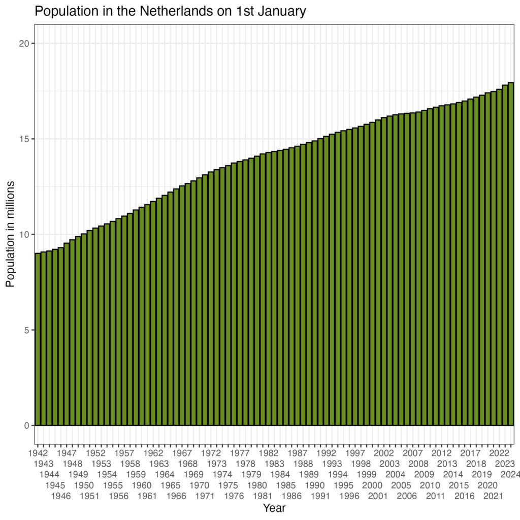
There is a continuous growth of the population. The number of breeding stork pairs is shown in the plot below:
df %>%
	ggplot(aes(x=as.factor(year), y=breeding_pairs)) +
	geom_bar(stat='identity', colour='black',fill='tomato') +
	ggtitle('Storks in the Netherlands') +
	scale_x_discrete('Year', guide = guide_axis(n.dodge = 5)) +
	scale_y_continuous('Number of Breeding Pairs', limits=c(0,2000)) +
	theme_bw()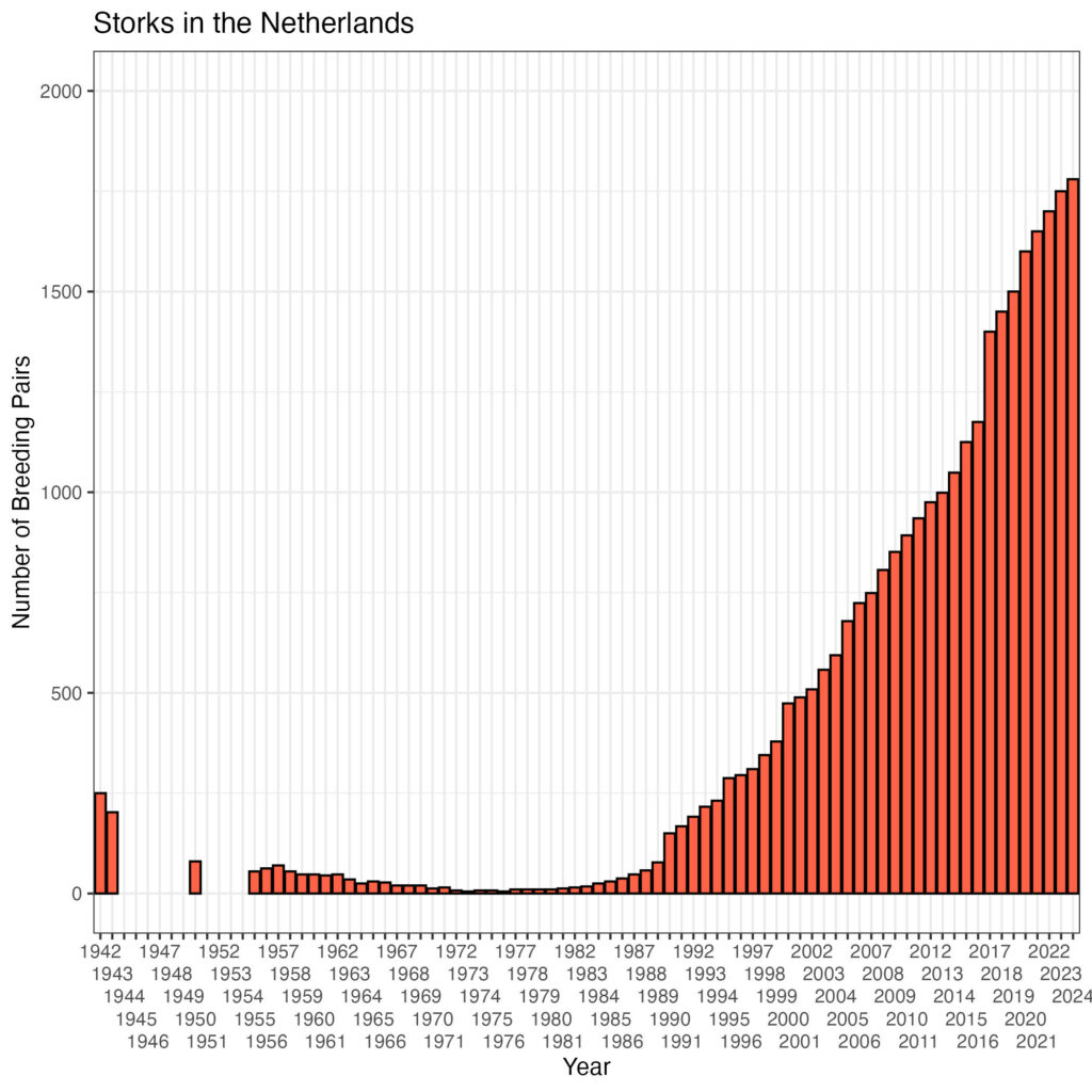
Is there an association between the population and the number of breeding stork pairs?
df %>%
	ggplot(aes(x= breeding_pairs, y=population_jan_01/1000000)) +
	geom_point() +
	geom_smooth(method='lm', se=TRUE) +
	ggtitle('Storks in The Netherlands') +
	scale_x_continuous('Number of Breeding Stork Pairs') +
	scale_y_continuous('Population on 1st January [millions]', limit=c(9, 20)) +
	theme_bw()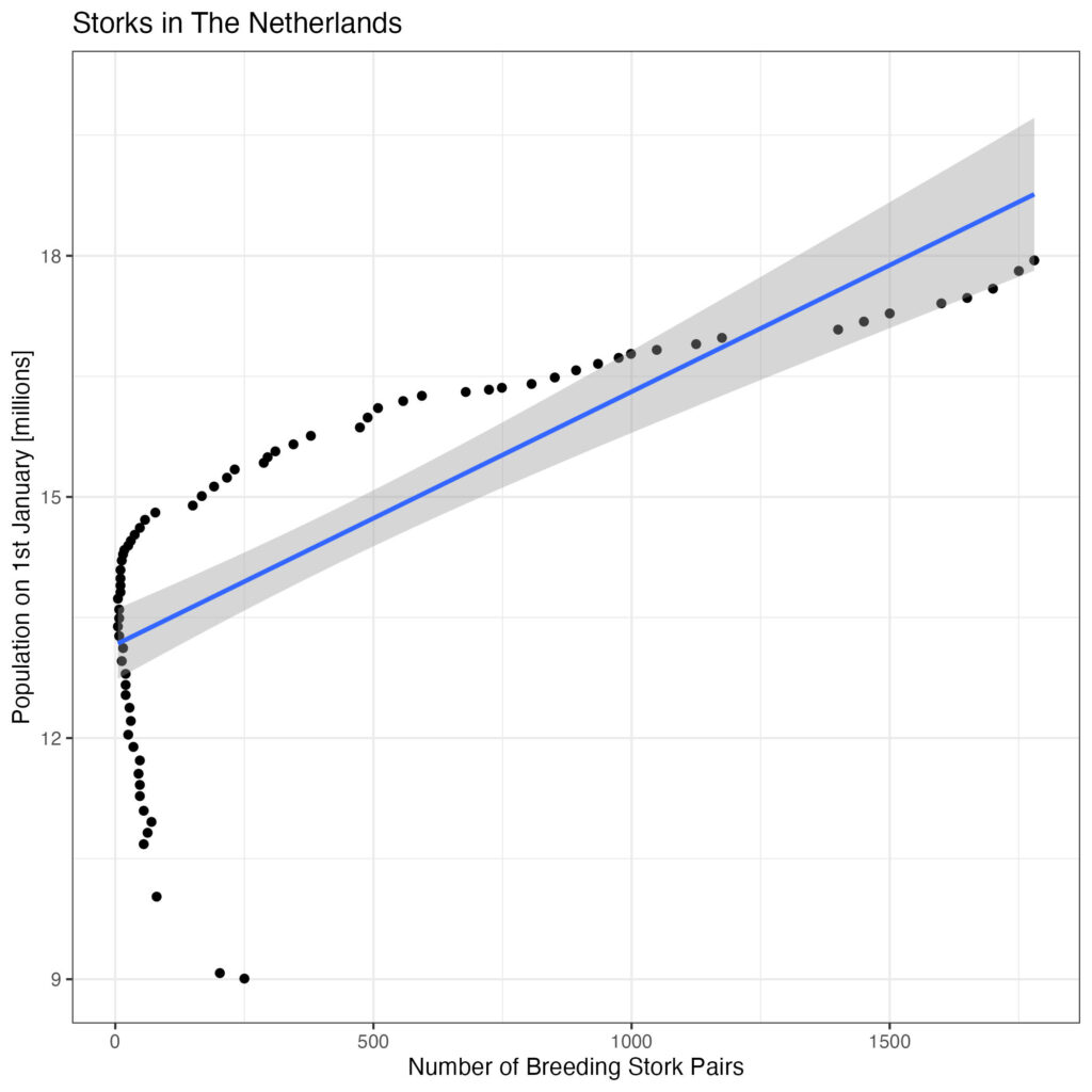
Please note the number of stork breeding pairs is a predictor variable here, so should be on the x-axis.
Although there appears to be a good correlation, there is statistical leverage at the left side of the plot. Let’s look what happens if we separate decades:
df %>%
	ggplot(aes(x=breeding_pairs, y=population_jan_01/1000000, colour=decade)) +
	geom_point() +
	geom_smooth(method='lm', se=TRUE) +
	ggtitle('Storks in The Netherlands') +
	scale_x_continuous('Number of Breeding Stork Pairs') +
	scale_y_continuous('Population on 1st January [millions]', limit=c(9, 20)) +
	theme_bw()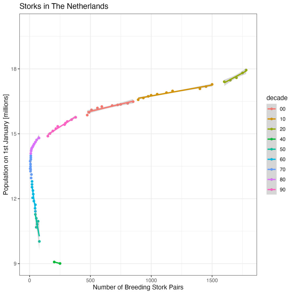
That does look better, but population growth is not necessarily due to an increase in birth rate … (it could also be due to immigration or reduced death rate). Let’s look at the number of new live births per thousand population in The Netherlands:
df %>%
	ggplot(aes(x=as.factor(year), y=born_ratio_per_1000)) +
	geom_bar(stat='identity', colour='black',fill='orchid') +
	ggtitle('Live Birth ratio in the Netherlands') +
	scale_x_discrete('Year', guide = guide_axis(n.dodge = 5)) +
	scale_y_continuous('Number of Births per 1,000 poputation') +
	theme_bw()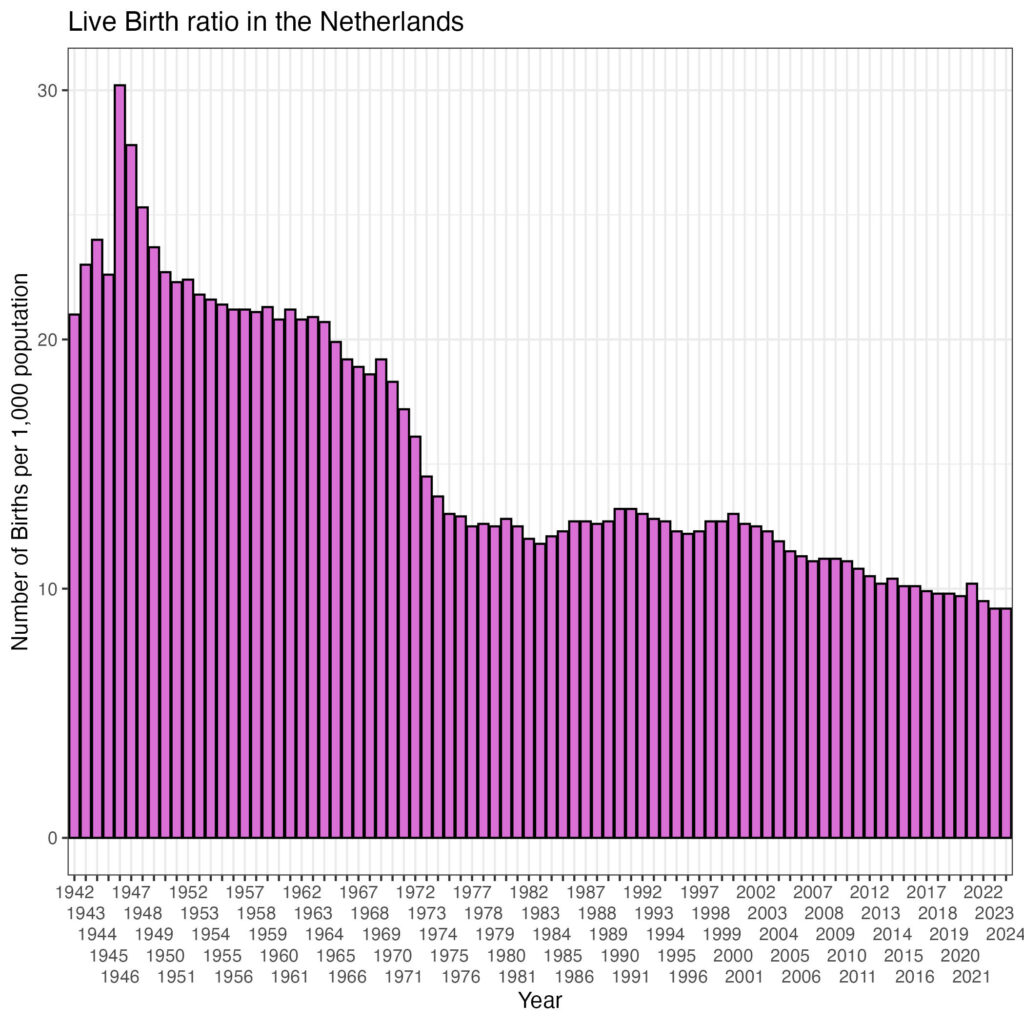
There is a clear decline in birth rate! What about the correlation with the number of breeding stork pairs?
df %>%
	ggplot(aes(x= breeding_pairs, y=born_ratio_per_1000)) +
	geom_point() +
	geom_smooth(method='lm', se=TRUE) +
	ggtitle('Storks in The Netherlands') +
	scale_x_continuous('Number of Breeding Stork Pairs') +
	scale_y_continuous('Number of Live Born Children / 1000 population') +
	theme_bw()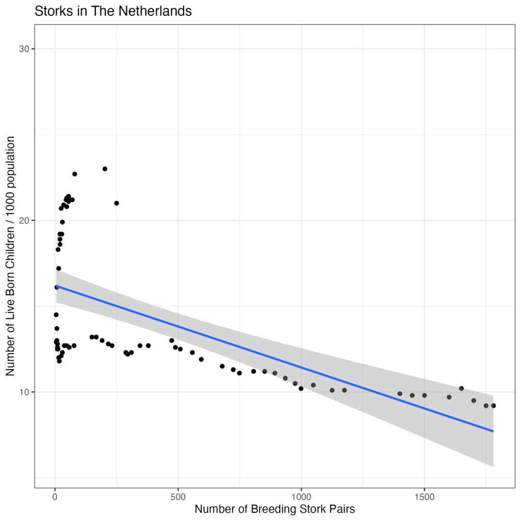
Again, breeding stork pairs are the predictor variable here and should be on the x-axis.
So, there is a negative association, with statistical leverage at the left side of the plot. Let’s separate decades:
df %>%
	ggplot(aes(x=breeding_pairs, y=born_ratio_per_1000, colour=decade)) +
	geom_point() +
	geom_smooth(method='lm', se=TRUE) +
	ggtitle('Storks in The Netherlands') +
	scale_x_continuous('Number of Breeding Stork Pairs') +
	scale_y_continuous('Number of Live Born Children / 1000 population', limit=c(5,25)) +
	theme_bw()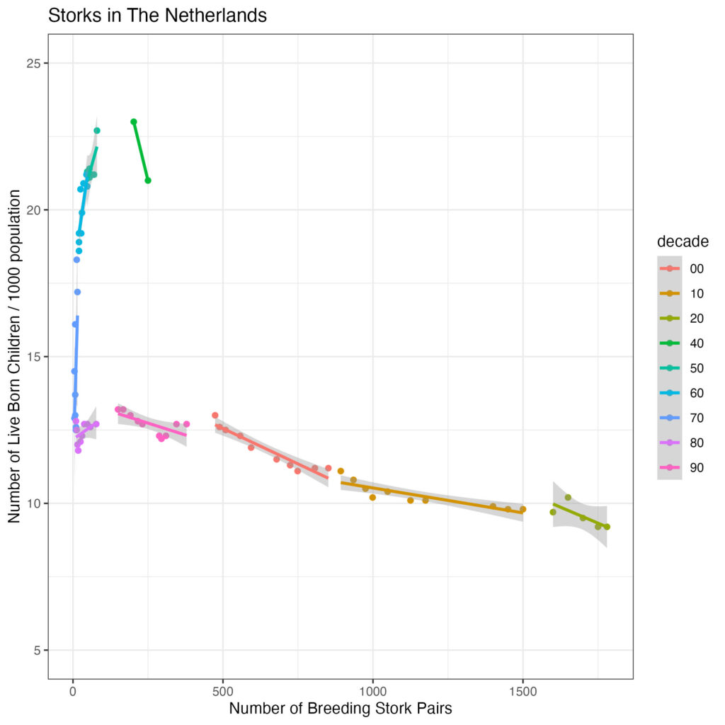
So, the leverage is due to the earlier data (before 1980). Let’s restrict the data to from 1980 onwards, calculate the correlation coefficients (Pearson for linear correlation, Spearman for ordered correlation as well as Kendall correlation) and create a label to add to the plot to follow:
decenia <- c('80', '90', '00', '10', '20')
# restrict to from 1980 onwards
df_80_onwards <-  subset(df, df$decade %in% decenia)

pearson = cor.test(df_80_onwards$breeding_pairs, df_80_onwards$born_ratio_per_1000, method = 'pearson')
(pearson_value = pearson$estimate)
(pearson_p = pearson$p.value)
spearman = cor.test(df_80_onwards$breeding_pairs, df_80_onwards$born_ratio_per_1000, method = 'spearman')
(spearman_value = spearman$estimate)
(spearman_p = spearman$p.value)
kendall = cor.test(df_80_onwards$breeding_pairs, df_80_onwards$born_ratio_per_1000, method = 'kendall')
(kendall_value = kendall$estimate)
(kendall_p = kendall$p.value)

# round corr coeff in %
pearson_value = round(pearson_value,3)*100
pearson_value
spearman_value = round(spearman_value,3)*100
spearman_value
kendall_value = round(kendall_value,3)*100
kendall_value

# correct to three decimals
pearson_p = ifelse(pearson_p < 0.001, 'p < 0.001', as.character(round(pearson_p, 3)))
pearson_p
spearman_p = ifelse(spearman_p < 0.001, 'p < 0.001', as.character(round(spearman_p, 3)))
spearman_p
kendall_p = ifelse(kendall_p < 0.001, 'p < 0.001', as.character(round(kendall_p, 3)))
kendall_p

pearson_label = paste('Pearson    Correlation Coeff: ', pearson_value, "%, ", pearson_p, sep='')
pearson_label
spearman_label = paste('Spearman Correlation Coeff: ', spearman_value, "%, ", spearman_p, sep='')
spearman_label
kendall_label = paste('Kendall     Correlation Coeff: ', kendall_value, "%, ", kendall_p, sep='')
kendall_label
Let’s have a look:
pearson_label
[1] "Pearson    Correlation Coeff: -93.1%, p < 0.001"
spearman_label
[1] "Spearman Correlation Coeff: -82.4%, p < 0.001"
kendall_label
[1] "Kendall     Correlation Coeff: -68.6%, p < 0.001"
Have a look at the plot from 1980 onwards, annotated with the correlation coefficients:
df_80_onwards %>%
	ggplot(aes(x=breeding_pairs, y=born_ratio_per_1000)) +
	geom_point() +
	geom_smooth(method='lm', se=TRUE) +
	ggtitle('Storks in The Netherlands - from 1980 onwards') +
	scale_x_continuous('Number of Breeding Stork Pairs') +
	scale_y_continuous('Number of Live Born Children / 1000 population', limits=c(8,14)) +
	annotate(geom = 'text', label = pearson_label , x = 750, y = 14, fontface = 'bold', hjust = 0) +
	annotate(geom = 'text', label = spearman_label , x = 750, y = 13.75, fontface = 'bold', hjust = 0) +
	annotate(geom = 'text', label = kendall_label , x = 750, y = 13.5, fontface = 'bold', hjust = 0) +
	theme_bw()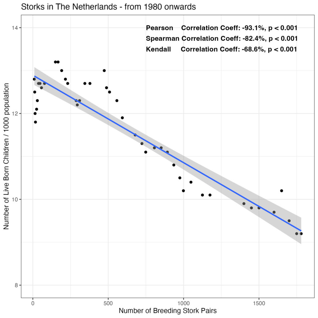
So, pretty impressive correlation, but it is a negative association: the more storks, the less live births. Perhaps a bit like modern medicine and the storks are having meetings to decide on delivery dates?