A correlation plot can be really useful to show the correlation between different variables. To create a correlation plot, use the corrplot package1. This package creates correlation plots from a correlation matrix.
Base R contains a data frame ‘mtcars’ with information about different cars. To show the first six observations (head) of the data frame and obtain further information about the variables in the data frame:
head(mtcars)
                   mpg cyl disp  hp drat    wt  qsec vs am gear carb
Mazda RX4         21.0   6  160 110 3.90 2.620 16.46  0  1    4    4
Mazda RX4 Wag     21.0   6  160 110 3.90 2.875 17.02  0  1    4    4
Datsun 710        22.8   4  108  93 3.85 2.320 18.61  1  1    4    1
Hornet 4 Drive    21.4   6  258 110 3.08 3.215 19.44  1  0    3    1
Hornet Sportabout 18.7   8  360 175 3.15 3.440 17.02  0  0    3    2
Valiant           18.1   6  225 105 2.76 3.460 20.22  1  0    3    1
str(mtcars)
'data.frame':	32 obs. of  11 variables:
 $ mpg : num  21 21 22.8 21.4 18.7 18.1 14.3 24.4 22.8 19.2 ...
 $ cyl : num  6 6 4 6 8 6 8 4 4 6 ...
 $ disp: num  160 160 108 258 360 ...
 $ hp  : num  110 110 93 110 175 105 245 62 95 123 ...
 $ drat: num  3.9 3.9 3.85 3.08 3.15 2.76 3.21 3.69 3.92 3.92 ...
 $ wt  : num  2.62 2.88 2.32 3.21 3.44 ...
 $ qsec: num  16.5 17 18.6 19.4 17 ...
 $ vs  : num  0 0 1 1 0 1 0 1 1 1 ...
 $ am  : num  1 1 1 0 0 0 0 0 0 0 ...
 $ gear: num  4 4 4 3 3 3 3 4 4 4 ...
 $ carb: num  4 4 1 1 2 1 4 2 2 4 ...
First, create a correlation matrix that contains the correlation coefficients between the different variables:
corr_matrix <- cor(mtcars)
corr_matrix
            mpg        cyl       disp         hp        drat         wt        qsec         vs          am       gear        carb
mpg   1.0000000 -0.8521620 -0.8475514 -0.7761684  0.68117191 -0.8676594  0.41868403  0.6640389  0.59983243  0.4802848 -0.55092507
cyl  -0.8521620  1.0000000  0.9020329  0.8324475 -0.69993811  0.7824958 -0.59124207 -0.8108118 -0.52260705 -0.4926866  0.52698829
disp -0.8475514  0.9020329  1.0000000  0.7909486 -0.71021393  0.8879799 -0.43369788 -0.7104159 -0.59122704 -0.5555692  0.39497686
hp   -0.7761684  0.8324475  0.7909486  1.0000000 -0.44875912  0.6587479 -0.70822339 -0.7230967 -0.24320426 -0.1257043  0.74981247
drat  0.6811719 -0.6999381 -0.7102139 -0.4487591  1.00000000 -0.7124406  0.09120476  0.4402785  0.71271113  0.6996101 -0.09078980
wt   -0.8676594  0.7824958  0.8879799  0.6587479 -0.71244065  1.0000000 -0.17471588 -0.5549157 -0.69249526 -0.5832870  0.42760594
qsec  0.4186840 -0.5912421 -0.4336979 -0.7082234  0.09120476 -0.1747159  1.00000000  0.7445354 -0.22986086 -0.2126822 -0.65624923
vs    0.6640389 -0.8108118 -0.7104159 -0.7230967  0.44027846 -0.5549157  0.74453544  1.0000000  0.16834512  0.2060233 -0.56960714
am    0.5998324 -0.5226070 -0.5912270 -0.2432043  0.71271113 -0.6924953 -0.22986086  0.1683451  1.00000000  0.7940588  0.05753435
gear  0.4802848 -0.4926866 -0.5555692 -0.1257043  0.69961013 -0.5832870 -0.21268223  0.2060233  0.79405876  1.0000000  0.27407284
carb -0.5509251  0.5269883  0.3949769  0.7498125 -0.09078980  0.4276059 -0.65624923 -0.5696071  0.05753435  0.2740728  1.00000000
Such a matrix is clearly difficult to interpret and a plot is much more illustrative:
library(corrplot)
corrplot(corr_matrix)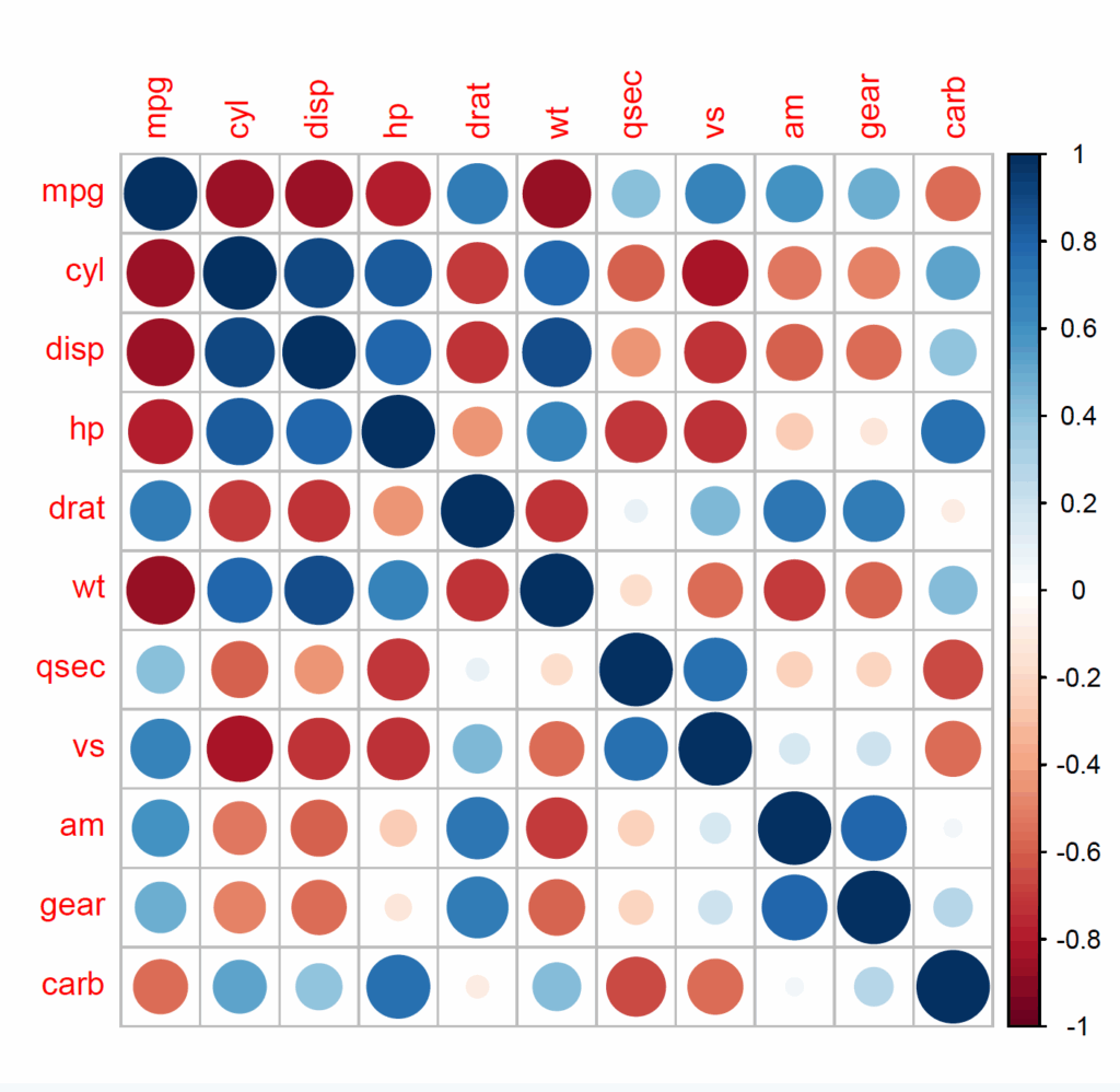
It is also possible to customise the plots; combine two types (mix number and colour) and cluster hierarchically:
corrplot.mixed(cor(mtcars), lower = 'number', upper = 'color', order = 'hclust')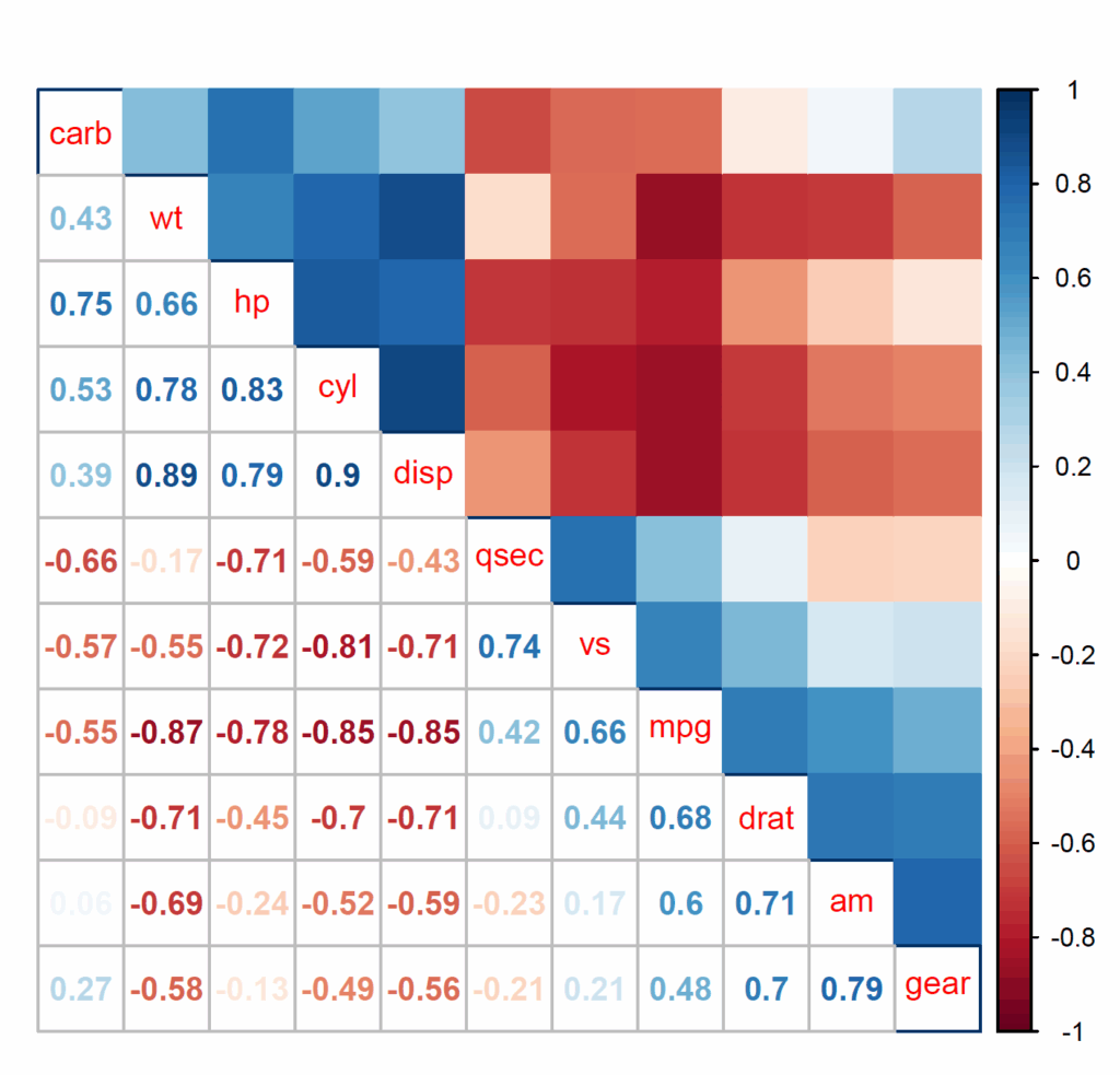
For further options; refer to the manual ??corrplot
Correlations can also be shown in a hierarchical edge bundling plot