As discussed, life table analysis is mostly obsolete and Kaplan-Meier, or product limit, survival analysis is the preferred method when the exact survival time is known. In Kaplan-Meier analysis, the probability of survival is not calculated at yearly intervals. Instead it is calculated after each failure. It is therefore necessary to rank the patients and create a table calculating the probability of survival. In general, Kaplan-Meier analysis is the preferred method of calculating survival. Again, this is best explained with an example.
The same example as in life table analysis is used. However, this time Kaplan-Meier (product limit) analysis will be performed on the data. The patients that are lost to follow up will be counted as a success. Therefore, the best-case scenario will be estimated. The table is shown below:
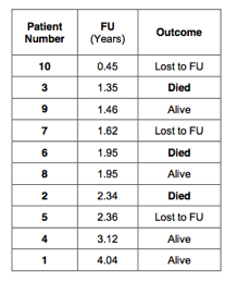
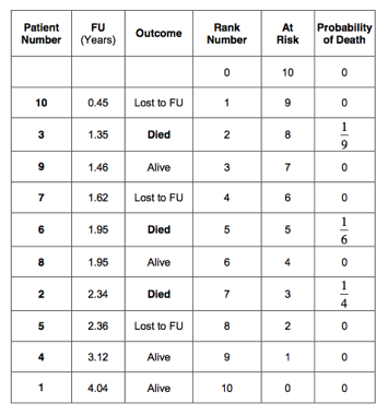
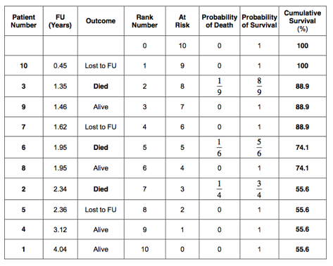
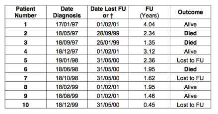 First, the patients are ranked according to the follow up. The columns with date of diagnosis or date last follow up are not required. Consequently, these have been removed:
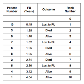
 Next, every patient is given a rank number. Start with rank 0 and in doing so we create one extra row in the table:
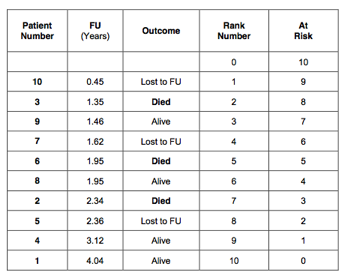
 Next, an extra column is created that indicates how many patients are at risk. Starting with rank 0, there are 10 patients are at risk. The patient with rank number 1 had the shortest follow up, 0.45 years. After this time, there were 9 patients left. The next patient had a follow up of 1.35 years and died. After this event there were 8 patients left, and so on. This is indicated in the 5th column of the table:
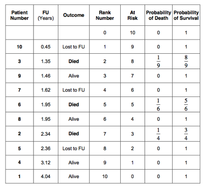
 Next, calculate the probability of failure (death). Always start with rank number 1. The patient with rank number 1 was lost to follow up (censored) after 0.45 years. We know that the patient was alive at that time. The probability of death for this patient is 0 out of 10 patients (0/10) equals 0; leaving 9 patients at risk. The patient with rank number 2 died after a follow up of 1.35 years. So, the probability of death in the period between 0.45 and 1.35 years is 1 out of 9 patients (1/9 = 0.1111); leaving 8 patients at risk. The next patient was alive after a follow up period of 1.46 years. The probability of death for this patient was 0/8 (=0); leaving 7 patients at risk. The patient with rank number 4 was lost to follow up after 1.62 years. The risk of death in the period between 1.46 and 1.62 years is therefore 0 out of 6 (=0); leaving 6 patients at risk. There were 2 patients who had a follow up of 1.95 years. One of these patients died and one patient was alive. The risk of death between 1.62 and 1.95 years of follow up is therefore 1 out of 6 (=0.16667); leaving 4 patients at risk. The next patient died after a follow up period of 2.34 years. In the follow up period between 1.95 and 2.34 years, the risk of death was 1/4 (=0.25). This left only 3 patients at risk. And so on. The probability of death is indicated in the 6th column of the table below:
 The probability of death in all censored patients is 0. Therefore, the probability of death has only to be calculated in the uncensored patients, were the event of interest (death) occurred. The probability of survival is 1 minus the probability of death. This has been indicated in the 7th column of the table:
 We have now calculated the probability of death from 0 to 0.45 years, 0.45 to 1.35 years, 1.35 to 1.46 years, 1.46 to 1.62 years, 1.62 to 1.95 years, 1.95 to 2.34 years and so on. However, the probability of surviving from 0 to 1.35 years depends on first having survived from 0 to 0.45 years and than from 0.45 to 1.35 years. As discussed, we will have to multiply these probabilities. Therefore, we will need to calculate the cumulative survival.
So, the probability of surviving to 1.35 years equals .
Similarly, the probability of surviving to 1.46 years is and so on.
The cumulative survival has been calculated for all patients and is indicated in the last column of the table below:
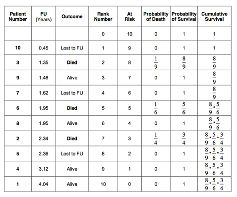 Or, calculated:
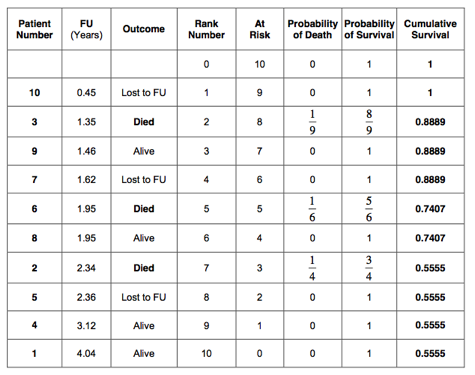 Or in percentages:
 The 5-year cumulative survival estimated by the Kaplan-Meier method is therefore 55.6%. This is very similar to the 52.4% 5-year survival as estimated by the life table method. As in the life table analysis, a survival curve can be plotted:
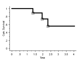 In Kaplan-Meier survival analysis, the curve is also stepped (as it is in life table analysis). However, the steps are at the times the event of interest (death) has occurred and NOT at yearly intervals. If there are many of these events, the curve will appear smooth (but remains stepped).
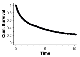
An example of a ‘smooth’ curve is shown in the graph below. This graph shows the cumulative survival, as estimated with the Kaplan-Meier method, of patients who were diagnosed with bony metastases following a cancer:
It has to be realised that the survival curve on its own does not provide all the information. One can easily be left with a false impression. It is always better to look at the table as well as the graph.
The 5-year survival, as estimated by life table analysis, was 52.4% (best-case scenario). However, from the table it can be seen that there was only 1 patient who had a survival of more than 4 years. This patient ‘keeps’ the cumulative survival at 52.4 % in the following years until he or she dies. Once the patient dies, the cumulative survival will drop suddenly from 52.4% to 0%. It might well have been that this 1 patient was wrongly diagnosed with cancer or, for reasons not completely understood, did extremely well. So let us assume, (in this example) that this patient would live to 9.1 years instead of 4.04 years. This would change the life table as follows:
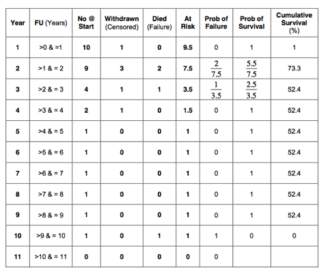 It can be seen that the cumulative survival remains 52.4% until year 9. In year 10, it suddenly drops to 0%. This is because there was only 1 patient followed up between 4 and 10 years. This 1 remaining patient keeps the cumulative survival artificially high and gives us a wrong impression. One has to be very suspicious when examining survival curves. It is very important to watch the ‘tail end’ of the curve. Particularly suspicious are sudden large drops in the curve. This could mean that either, there were a number of patients who all failed at the same time or, more likely, that the number of patients is small and one failure caused the large drop. The ‘tail end’ of the survival curve can give a wrong impression if number of patients remaining in follow up is low. It is always advisable to look at a survival curve in conjunction with the corresponding table.
For people reading publications, it is preferable to look at a graph that contains all the information. It can be very helpful to indicate the number of patients remaining in follow up next to the data points in the survival curve. If the number of patients remaining in follow up is low, the curve has to be interpreted with caution.
Another way of indicating the degree of caution one has to have in interpreting a survival curve is to calculate the 95% confidence interval. Error bars can be indicated in the survival curve. If the error bars are wide, the curve has to be interpreted with caution. There are several methods of calculating the 95% confidence interval. However, this is beyond the scope of this book.
There are two definitions that are commonly used in the literature. These are 5-year survival and median survival.
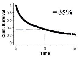
5-Year Survival
The five-year survival is the cumulative probability of being alive after 5 years. This is shown in the graph below:
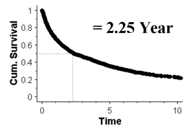
Median Survival
The median survival is the time it takes for the cumulative survival to be 50%. The graph below shows the median survival to be 2.25 year:
The use of survival analysis has been extended beyond estimating survival rates in cancer patients. It has also been used to estimate the survival of total joint replacements. In this case, it is not so easy to define a ‘hard end point’.
Death can be defined as an ‘end point’. Death is a ‘hard end point’ as there is no confusion about it. If one wants to use survival curves to estimate the longevity of total joint replacements, an ‘end point’ has to be chosen that indicates when the joint replacement has failed. It seems obvious to take the date the primary joint replacement has been revised to the next joint replacement as ‘hard end point’. Indeed, ‘revision’ of the primary prosthesis is commonly used as point of failure in the published literature. However, one has to realise that ‘revision’ is not a ‘hard end point’. A surgeon might well decide not to revise an implant as the procedure is felt to be too difficult or the patient is unfit. Consequently, the patient is being counted as a ‘success’, whilst in reality the joint replacement has failed.