For a more detailed discussion about survival analysis, please refer to the relevant section. When the failure time is know accurately, Kaplan-Meier analysis is the preferred method of analysis and Life Table analysis is mostly obsolete. Here, several methods on how to create a survival plot in R are discussed.
Download the plotsurvival.rda dataset for this example. The data frame is called plotsurvival and the variables are: number (patient number), fu (continuous; follow up time), group (categorical data; Hip 1 or Hip 2) and censor (binary outcome variable). To show the data:
plotsurvival
number fu group censor
1 1 5.2 Hip 1 0
2 2 6.3 Hip 1 0
3 3 7.0 Hip 1 0
4 4 8.5 Hip 1 0
5 5 9.4 Hip 1 0
6 6 10.1 Hip 1 0
7 7 11.2 Hip 1 0
8 8 12.0 Hip 1 0
9 9 12.5 Hip 1 1
10 10 12.7 Hip 1 0
11 11 4.5 Hip 2 1
12 12 5.8 Hip 2 0
13 13 6.9 Hip 2 0
14 14 7.8 Hip 2 1
15 15 8.2 Hip 2 1
16 16 8.9 Hip 2 1
17 17 9.5 Hip 2 1
18 18 10.2 Hip 2 0
19 19 11.5 Hip 2 0
20 20 12.9 Hip 2 0
To perform survival analysis, the survival package: 1 should be installed.
library(survival)
Method 1, using Deducer Survival 2:
Perhaps the easiest way to create a survival plot is to use the menu driven DeducerSurvival package 2 in JGR / Deducer. To show overall survival of the two hips select the variable fu as Follow Up time and the variable censor as Event (no group):
attach( plotsurvival )
mySurvival = Surv( fu , censor )
summary(mySurvival)
time status
Min. : 4.500 Min. :0.0
1st Qu.: 6.975 1st Qu.:0.0
Median : 9.150 Median :0.0
Mean : 9.055 Mean :0.3
3rd Qu.:11.275 3rd Qu.:1.0
Max. :12.900 Max. :1.0
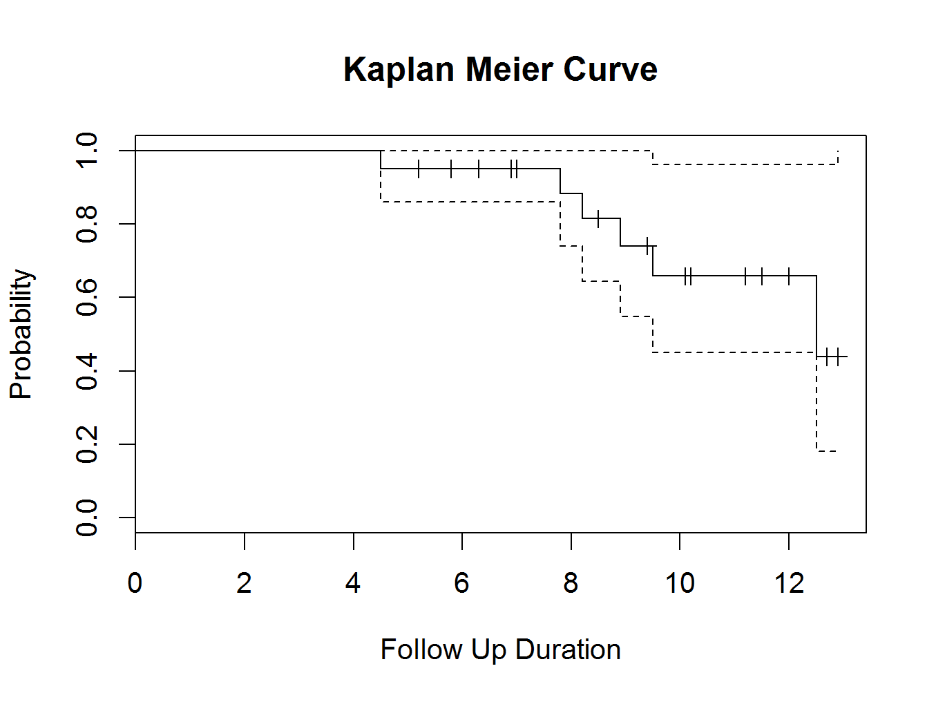
mycurve=survfit(mySurvival~1,conf.int= 0.95 )
summary(mycurve)
Call: survfit(formula = mySurvival ~ 1, conf.int = 0.95)
time n.risk n.event survival std.err lower 95% CI upper 95% CI
4.5 20 1 0.950 0.0487 0.859 1.000
7.8 14 1 0.882 0.0795 0.739 1.000
8.2 13 1 0.814 0.0982 0.643 1.000
8.9 11 1 0.740 0.1138 0.548 1.000
9.5 9 1 0.658 0.1275 0.450 0.962
12.5 3 1 0.439 0.1982 0.181 1.000
plot(mycurve, col=c( ” black ” , ” black ” , ” black ” ))
title(main= “Kaplan Meier Curve” ,xlab= “Follow Up Duration” ,ylab= “Probability” )
 Or split by type of hip replacement (select group as Group in the dialogue and insert ‘blue’ for Colour 1 and ‘red’ for Colour 2):
mySurvival = Surv( fu , censor )
summary(mySurvival)
time status
Min. : 4.500 Min. :0.0
1st Qu.: 6.975 1st Qu.:0.0
Median : 9.150 Median :0.0
Mean : 9.055 Mean :0.3
3rd Qu.:11.275 3rd Qu.:1.0
Max. :12.900 Max. :1.0
mycurve=survfit(mySurvival~ group ,conf.int= 0.95 )
summary(mycurve)
Call: survfit(formula = mySurvival ~ group, conf.int = 0.95)
group=Hip 1
time n.risk n.event survival std.err lower 95% CI
12.500 2.000 1.000 0.500 0.354 0.125
upper 95% CI
1.000
group=Hip 2
time n.risk n.event survival std.err lower 95% CI upper 95% CI
4.5 10 1 0.900 0.0949 0.732 1.00
7.8 7 1 0.771 0.1442 0.535 1.00
8.2 6 1 0.643 0.1679 0.385 1.00
8.9 5 1 0.514 0.1769 0.262 1.00
9.5 4 1 0.386 0.1732 0.160 0.93
plot(mycurve, col=c( ” blue ” , ” red ” , ” black ” ))
title(main= “Kaplan Meier Curve” ,xlab= “Follow Up Duration” ,ylab= “Probability” )
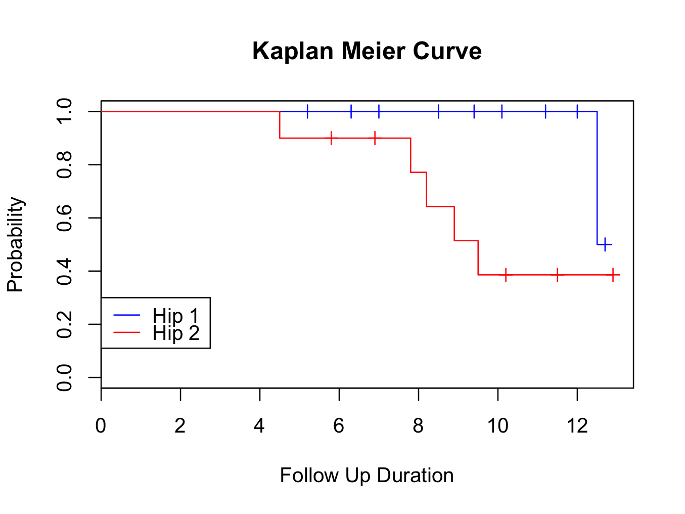
There is an error in the DeducerSurvival package. The plot legend does not always correctly indicate the curve (here is does). Check with the console output which curve is represented by which colour. If necessary, change the code to correct the legend colour / order.
Method 2, in R console:
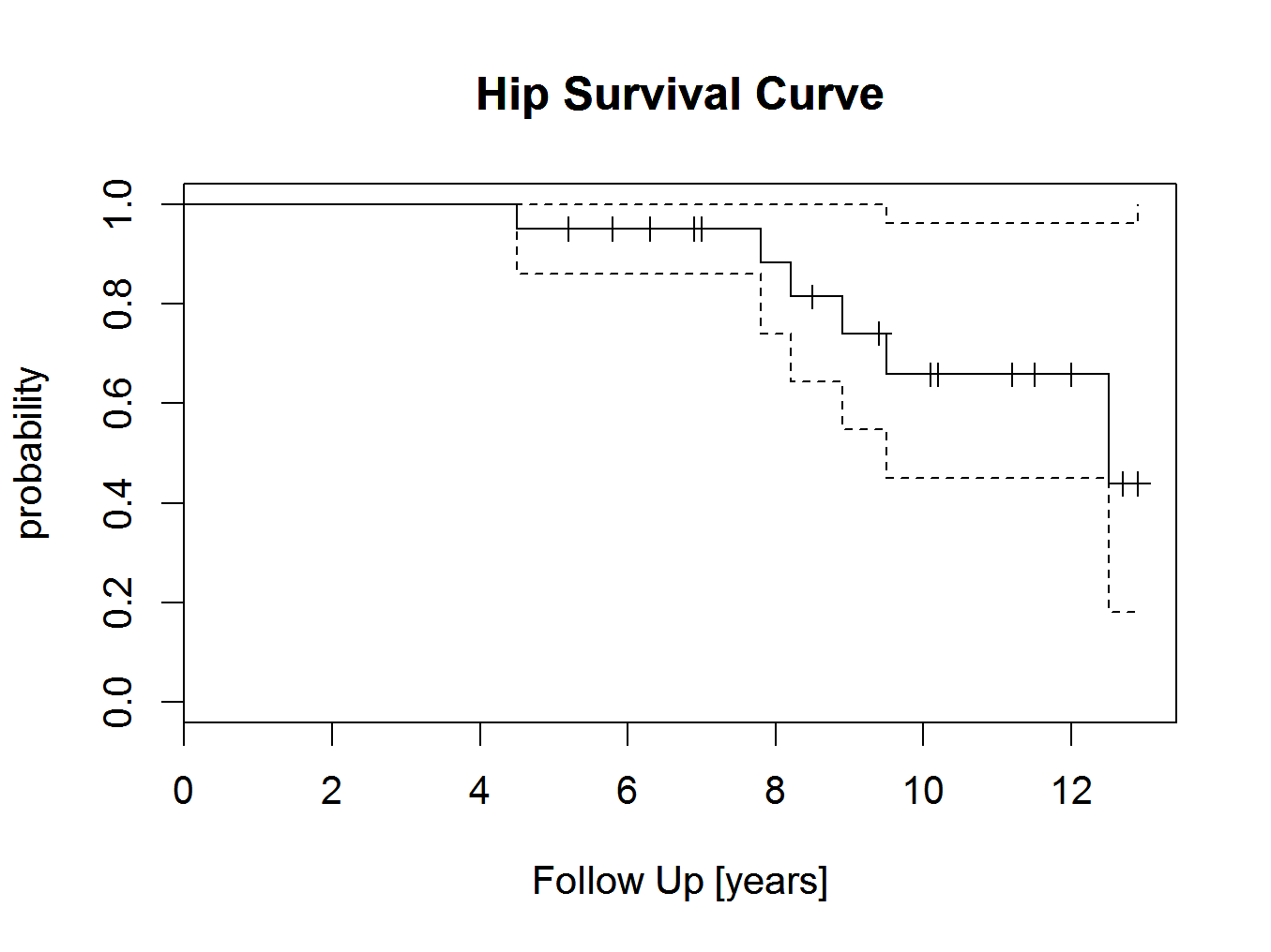
First load the survival library and create a survival object called ‘hipsurvival':
library(survival)
hipsurvival<-Surv(fu,censor)
A summary can be requested:
summary(hipsurvival)
time status
Min. : 4.500 Min. :0.0
1st Qu.: 6.975 1st Qu.:0.0
Median : 9.150 Median :0.0
Mean : 9.055 Mean :0.3
3rd Qu.:11.275 3rd Qu.:1.0
Max. :12.900 Max. :1.0
Next, create a survival curve with 95% confidence intervals from the survival object and call this ‘hipsurvivalcurve’ (the ~1, tilde one is required for the function):
hipsurvivalcurve<-survfit(hipsurvival~1,conf.int=0.95)
To plot the curve:
plot(hipsurvivalcurve)
and add a title and axis labels:
title(main=’Hip Survival Curve’,xlab=’Follow Up [years]’,ylab=’probability’)
 To create a plot grouped by type of hip replacement is very straight forward. Instead of using the ~1 in the survival curve object, use:
hipsurvivalcurve2<-survfit(hipsurvival~group,conf.int=0.95)
A new plot can be created by plotting the object, with the first curve in red and the second in green (if there are more groups, more colours can be added):
plot(hipsurvivalcurve2,col=c(‘red’,’green’))
title(main=’Hip Survival Curve’,xlab=’Follow Up [years]’,ylab=’probability’)
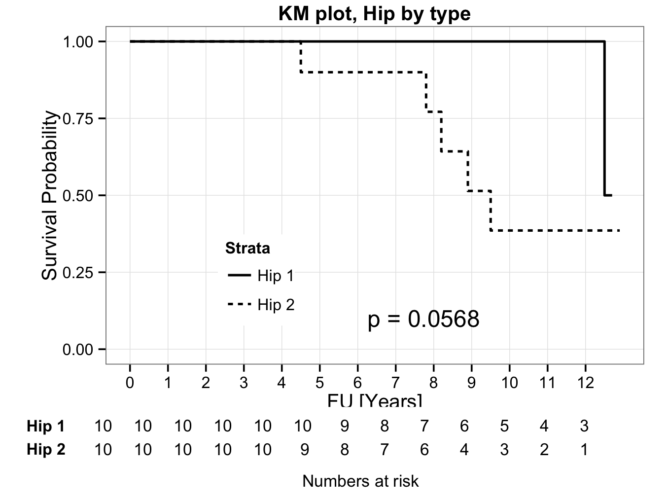
 Method 3, curves with numbers at risk
It may be preferable to have the number of patients at risk indicated in the plot. The KMatRisk function can be used for this. Copy the function to the clipboard, paste it into the console and hit return. The function should now be available in R (the library survival should also be loaded).
Create the survival curve object directly (in one step) from the data and call this hipfit:
hipfit<-survfit(Surv(fu,censor)~group,data=plotsurvival)
Next call the loaded function to create the survival curve with numbers at risk:
ggkm(hipfit,timeby=1,ystratalabs=c(“Hip 1″,”Hip 2″),main=”KM plot, Hip by type”,xlabs=”FU [Years]”)
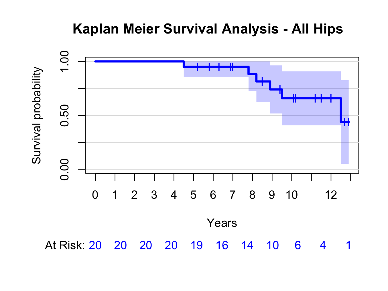
Method 4, curves using the product limit package 3:
The prodlim package creates nice survival curves. First install the library:
library(prodlim)
Create a Kaplan-Meier object using the product limit method:
kmhipfit <- prodlim(Hist(fu, censor) ~ 1, data = plotsurvival)
To create a plot that shows numbers at risk at yearly intervals with a shadowed 95% confidence interval:
plot(kmhipfit,percent=FALSE,axes=TRUE,axis1.at=seq(0,kmhipfit$maxtime+1,1),axis1.lab=seq(0,kmhipfit$maxtime+1,1),marktime=TRUE,xlab=”Years”,atrisk=TRUE,atrisk.labels=”At Risk:”,confint=TRUE,confint.citype=”shadow”,col=4)
And add a title:
title(main= “Kaplan Meier Survival Analysis – All Hips”)
 Similarly, create a plot grouped by type of hip replacement (instead of ~1, use ~group):
kmhipfit2 <- prodlim(Hist(fu, censor) ~ group, data = plotsurvival)
plot(kmhipfit2,percent=FALSE,axes=TRUE,axis1.at=seq(0,kmhipfit2$maxtime+1,1),axis1.lab=seq(0,kmhipfit2$maxtime+1,1),marktime=TRUE,xlab=”Years”,atrisk=TRUE,atrisk.labels=”At Risk:”,confint=TRUE,confint.citype=”shadow”,col=c(4,3),legend=TRUE,legend.x=0,legend.y=0.4,legend.cex=1)
title(main= “Kaplan Meier Survival Analysis – By Hip Type”)
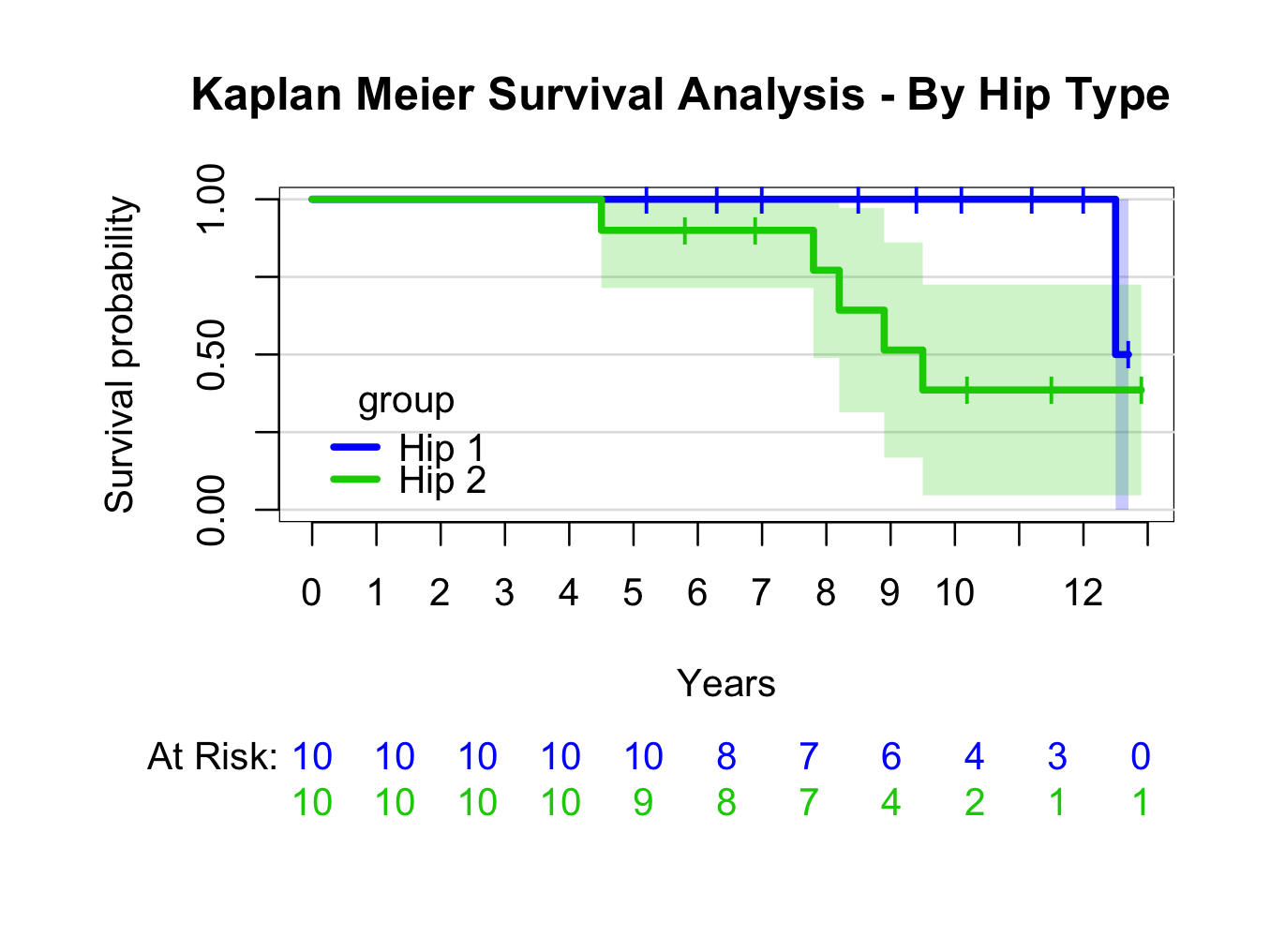 For more information re prodlim options:
??prodlim
Please note the syntax to place the legend position.
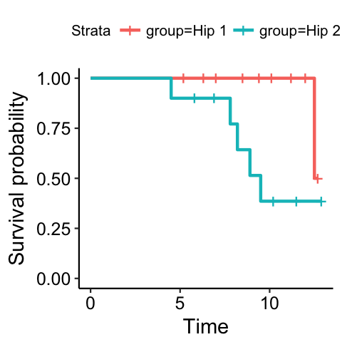
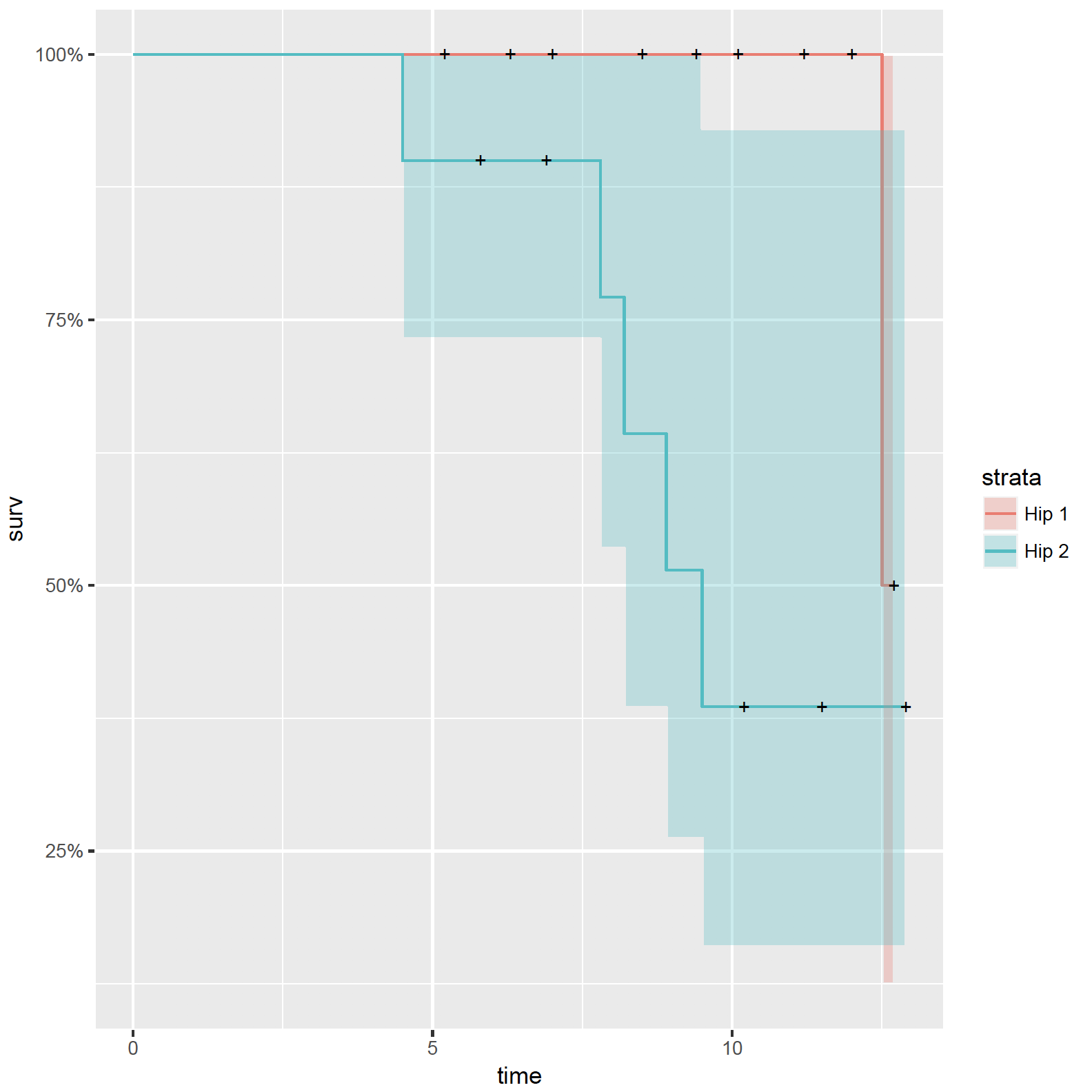
Method 5, using the survminer package 4 to create survival curves with ggplot2 5:
Still using the plotsurvival.rda dataset in this example, make sure the appropriate packages are available:
library(survival)
library(ggplot2)
library(survminer)
First create a survival object and examine it:
fit <- survfit(Surv(fu, censor) ~ group, data = plotsurvival)
fit
Call: survfit(formula = Surv(fu, censor) ~ group, data = plotsurvival)
n events median 0.95LCL 0.95UCL
group=Hip 1 10 1 12.5 12.5 NA
group=Hip 2 10 5 9.5 8.2 NA
summary(fit)
Call: survfit(formula = Surv(fu, censor) ~ group, data = plotsurvival)
group=Hip 1
time n.risk n.event survival std.err lower 95% CI upper 95% CI
12.500 2.000 1.000 0.500 0.354 0.125 1.000
group=Hip 2
time n.risk n.event survival std.err lower 95% CI upper 95% CI
4.5 10 1 0.900 0.0949 0.732 1.00
7.8 7 1 0.771 0.1442 0.535 1.00
8.2 6 1 0.643 0.1679 0.385 1.00
8.9 5 1 0.514 0.1769 0.262 1.00
9.5 4 1 0.386 0.1732 0.160 0.93
To create a basic survival plot:
ggsurvplot(fit)
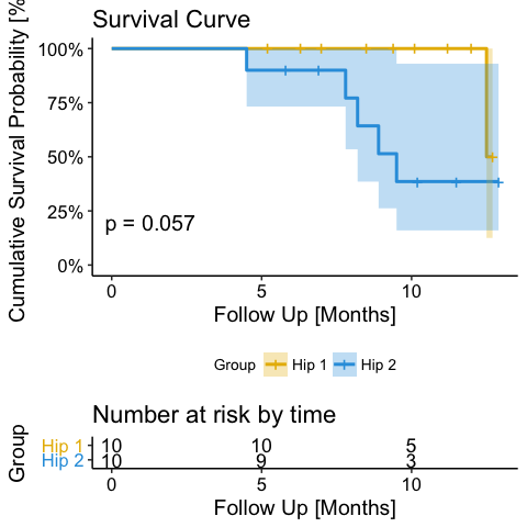
 Or a more advanced plot:
ggsurvplot(fit, legend = ‘bottom’, legend.title = ‘Group’, legend.labs = c(‘Hip 1′, ‘Hip 2′), palette = c(“#E7B800″, “#2E9FDF”),conf.int = TRUE, conf.int.style = ‘ribbon’, pval = TRUE, risk.table = TRUE, main = ‘Survival Curve’, xlab = ‘Follow Up [Months]’, ylab = ‘Cumulative Survival Probability [%]’, surv.scale = ‘percent’)
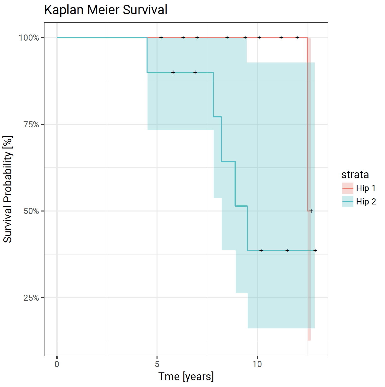
Method 6, using the ggfortify package 6 to create survival curves with ggplot2 5:
library(survival)
library(ggfortify)
Loading required package: ggplot2
fit <- survfit(Surv(fu, censor) ~ group, data = plotsurvival)
> autoplot(fit)
Or for a more advanced plot, ggplot2 5 calls can be added:
autoplot(fit) + theme_bw(base_size = 14, base_family = “Roboto”) + xlab(“Tme [years]”) + ylab(“Survival Probability [%]”) + ggtitle(“Kaplan Meier Survival”)
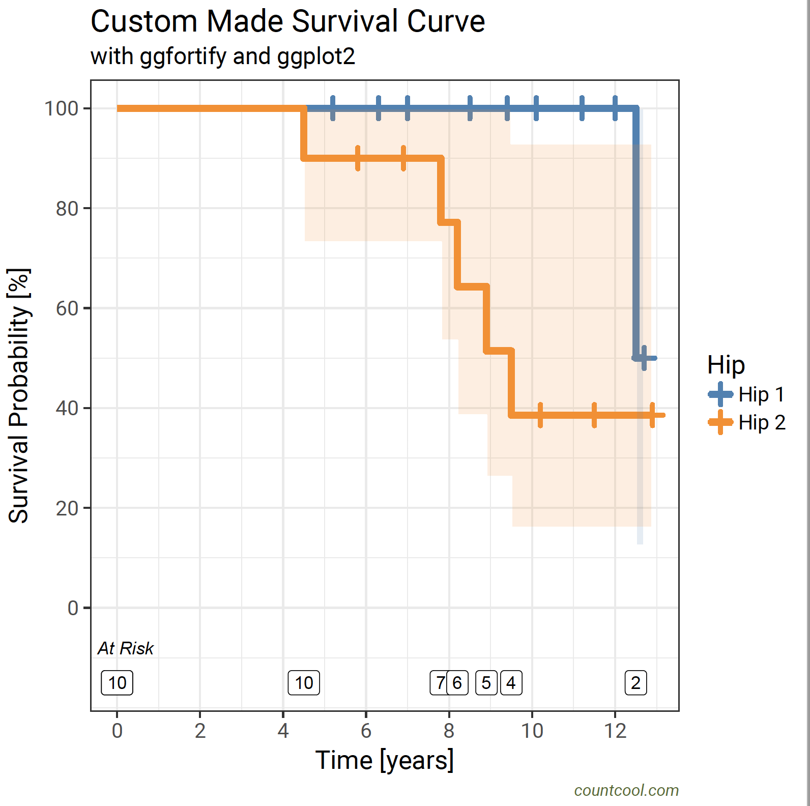
Method 7, using the ggfortify package 6 to create bespoke survival curves with ggplot2 5 and the RcmdrPlugin.KMggplot2 package 7:
For this method method, the RcmdrPlugin.KMggplot2 package 7 should be installed:
install.packages(“RcmdrPlugin.KMggplot2″)
However, there is no need to load the package with the library command. The survival and ggfortify packages should be loaded:
library(survival)
library(ggfortify)
fit <- survfit(Surv(fu, censor) ~ group, data = plotsurvival)
fit
Call: survfit(formula = Surv(fu, censor) ~ group, data = plotsurvival)
n events median 0.95LCL 0.95UCL
group=Hip 1 10 1 12.5 12.5 NA
group=Hip 2 10 5 9.5 8.2 NA
summary(fit)
Call: survfit(formula = Surv(fu, censor) ~ group, data = plotsurvival)
group=Hip 1
time n.risk n.event survival std.err lower 95% CI upper 95% CI
12.500 2.000 1.000 0.500 0.354 0.125 1.000
group=Hip 2
time n.risk n.event survival std.err lower 95% CI upper 95% CI
4.5 10 1 0.900 0.0949 0.732 1.00
7.8 7 1 0.771 0.1442 0.535 1.00
8.2 6 1 0.643 0.1679 0.385 1.00
8.9 5 1 0.514 0.1769 0.262 1.00
9.5 4 1 0.386 0.1732 0.160 0.93
Convert the survival object to a data frame with the fortify() function:
plot_data <- fortify(fit, surv.connect = TRUE)
plot_data
time n.risk n.event n.censor surv std.err upper lower strata
1 0.0 10 0 0 1.0000000 0.0000000 1.0000000 1.0000000 Hip 1
2 0.0 10 0 0 1.0000000 0.0000000 1.0000000 1.0000000 Hip 2
3 5.2 10 0 1 1.0000000 0.0000000 1.0000000 1.0000000 Hip 1
4 6.3 9 0 1 1.0000000 0.0000000 1.0000000 1.0000000 Hip 1
5 7.0 8 0 1 1.0000000 0.0000000 1.0000000 1.0000000 Hip 1
6 8.5 7 0 1 1.0000000 0.0000000 1.0000000 1.0000000 Hip 1
7 9.4 6 0 1 1.0000000 0.0000000 1.0000000 1.0000000 Hip 1
8 10.1 5 0 1 1.0000000 0.0000000 1.0000000 1.0000000 Hip 1
9 11.2 4 0 1 1.0000000 0.0000000 1.0000000 1.0000000 Hip 1
10 12.0 3 0 1 1.0000000 0.0000000 1.0000000 1.0000000 Hip 1
11 12.5 2 1 0 0.5000000 0.7071068 1.0000000 0.1250488 Hip 1
12 12.7 1 0 1 0.5000000 0.7071068 1.0000000 0.1250488 Hip 1
13 4.5 10 1 0 0.9000000 0.1054093 1.0000000 0.7320116 Hip 2
14 5.8 9 0 1 0.9000000 0.1054093 1.0000000 0.7320116 Hip 2
15 6.9 8 0 1 0.9000000 0.1054093 1.0000000 0.7320116 Hip 2
16 7.8 7 1 0 0.7714286 0.1868706 1.0000000 0.5348489 Hip 2
17 8.2 6 1 0 0.6428571 0.2612546 1.0000000 0.3852425 Hip 2
18 8.9 5 1 0 0.5142857 0.3438807 1.0000000 0.2621155 Hip 2
19 9.5 4 1 0 0.3857143 0.4489847 0.9299128 0.1599887 Hip 2
20 10.2 3 0 1 0.3857143 0.4489847 0.9299128 0.1599887 Hip 2
21 11.5 2 0 1 0.3857143 0.4489847 0.9299128 0.1599887 Hip 2
22 12.9 1 0 1 0.3857143 0.4489847 0.9299128 0.1599887 Hip 2
ggplot(plot_data, aes(x = time, y = surv * 100)) +
# plot the survival curve(s)
geom_step(aes(colour = strata), size = 2) +
# add the censor indicators
geom_point(data = subset(plot_data, n.censor > 0), shape = 3, size = 3, stroke = 2, aes(colour = strata)) +
# add confidence intervals using the stepribbon geom in the RcmdrPlugin.KMggplot2 package
RcmdrPlugin.KMggplot2::geom_stepribbon(data = plot_data, aes(x = time, ymin = lower * 100, ymax = upper * 100, fill = strata), alpha = 0.15, colour = “transparent”, show.legend = FALSE, kmplot = TRUE) +
# set the colours of the confidence intervals
scale_fill_manual(values = c(“steelblue”, “darkorange”)) +
# set the colours of the survival curves
scale_colour_manual(values = c(“steelblue”, “darkorange”), name = “Hip”) +
# apply a theme based on the Roboto font size 16
theme_bw(base_size = 16, base_family = “Roboto”) +
# add a title, x label, y label and footnote
labs(title = “Custom Made Survival Curve”, subtitle = “with ggfortify and ggplot2″, x = “Time [years]”, y = “Survival Probability [%]”, caption = “countcool.com”) +
# set the caption to a smaller italic font in darkolivergreen colour
theme(plot.caption = element_text(colour = “darkolivegreen”, face = “italic”, size = 10)) +
# set the y axis limit in steps of 20 %
scale_y_continuous(breaks = seq(0, 100, 20)) +
# set the x axis in steps of 2 years
scale_x_continuous(breaks = seq(0, max(plot_data$time) + 2, 2)) +
# add numbers at risk when failed (label creates a border)
annotate(geom = “label”, x = subset(plot_data$time, plot_data$n.censor == 0), y = -15, label = subset(plot_data$n.risk, plot_data$n.censor == 0)) +
annotate(geom = “text”, x = 0.2, y = -8, label = “At Risk”, fontface = “italic”)
The code can be copied and pasted into the R console. However the quotation marks may need re-entering.
This should produce the plot below:
Method 8, using the ggfortify package 6 to create a function for bespoke survival curves with ggplot2 5 and the RcmdrPlugin.KMggplot2 package 7:
For this method, the RcmdrPlugin.KMggplot2 package 7 should be installed:
install.packages(“RcmdrPlugin.KMggplot2″)
However, there is no need to load the package with the library command.
Load the following function:
by copying and pasting the contents in the R console.
Run it with the following command:
cool_survival(plotsurvival, time = plotsurvival$fu, censor = plotsurvival$censor, group = plotsurvival$group)
This should produce the same plot as before: