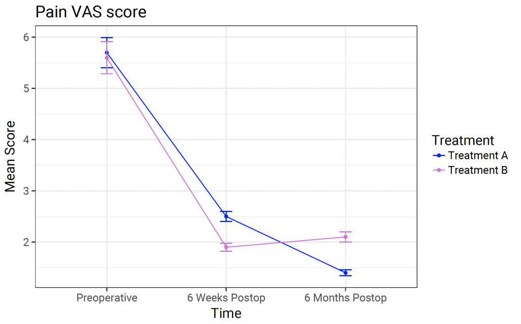
A line plot can be useful to demonstrate a trend in mean over time or categories.
Consider the following data frame with calculated results over time of treatment A and treatment B. The data frame contains factorial variables ‘treatment’ and ‘ti me’ as well as calculated mean pain VAS and the coresponding standard error of the mean.
result <- data.frame(treatment = c(“A”, “B”, “A”, “B”, “A”, “B”),
time = c(“Preop”, “Preop”, “6 Weeks”, “6 Weeks”, “6 Months”, “6 Months”),
mean =c(5.7, 5.6, 2.5, 1.9, 1.4, 2.1),
sem = c(0.15, 0.16, 0.05, 0.04, 0.03, 0.05))
Inspect the data frame:
str(result)
‘data.frame': 6 obs. of 4 variables:
$ treatment: Factor w/ 2 levels “A”,”B”: 1 2 1 2 1 2
$ time : Factor w/ 3 levels “6 Months”,”6 Weeks”,..: 3 3 2 2 1 1
$ mean : num 5.7 5.6 2.5 1.9 1.4 2.1
$ sem : num 0.15 0.16 0.05 0.04 0.03 0.05
To create a line plot with ggplot 1:
result %>%
ggplot() + geom_point(aes(x = time, y = mean, group = treatment, colour = treatment)) +
geom_line(aes(x = time, y = mean, group = treatment, colour = treatment)) +
scale_x_discrete(“Time”, limits = c(“Preop”, “6 Weeks”, “6 Months”), labels = c(“Preoperative”, “6 Weeks Postop”, “6 Months Postop”)) +
geom_errorbar(aes(x = time, ymin = mean – 1.96 * sem, ymax = mean + 1.96 * sem, colour = treatment), width = 0.1) +
scale_colour_manual(values = c(“blue”, “orchid”), name=”Treatment”, breaks=c(“A”, “B”), labels=c(“Treatment A”, “Treatment B”)) +
scale_y_continuous(“Mean Score”) +
ggtitle(“Pain VAS score”)
