Similar to language, graphics are subject to rules. This was called the ‘grammar of graphics’ by Leland Wilkinson and further described in Hadley Wickham’s book 1. The grammar of graphics is applied in the ggplot2 package 2 that is part of the tidyverse family of packages: http://ggplot2.tidyverse.org/
The ggplot2 package 2 is very versatile and allows the creation of high quality plots. This section gives the basis on how to create a plot using the grammar of graphics. Further information is available in the comprehensive package reference manual and Winston Chang’s R Graphics Cookbook 3 (that is also online: http://www.cookbook-r.com/Graphs/). In addition Stack Overflow is a useful source of information.
Further examples of different plots and how to create them is also described in the plots section.
For the examples below, the ggplot2 package2 should be installed and loaded:
library(ggplot2)
The package contains sample data of 53,940 diamonds that can be viewed:
diamonds
# A tibble: 53,940 x 10
carat cut color clarity depth table price x y z
<dbl> <ord> <ord> <ord> <dbl> <dbl> <int> <dbl> <dbl> <dbl>
1 0.23 Ideal E SI2 61.5 55 326 3.95 3.98 2.43
2 0.21 Premium E SI1 59.8 61 326 3.89 3.84 2.31
3 0.23 Good E VS1 56.9 65 327 4.05 4.07 2.31
4 0.290 Premium I VS2 62.4 58 334 4.2 4.23 2.63
5 0.31 Good J SI2 63.3 58 335 4.34 4.35 2.75
6 0.24 Very Good J VVS2 62.8 57 336 3.94 3.96 2.48
7 0.24 Very Good I VVS1 62.3 57 336 3.95 3.98 2.47
8 0.26 Very Good H SI1 61.9 55 337 4.07 4.11 2.53
9 0.22 Fair E VS2 65.1 61 337 3.87 3.78 2.49
10 0.23 Very Good H VS1 59.4 61 338 4 4.05 2.39
# … with 53,930 more rows
The diamond data frame is used in the examples described below.
Basic elements
Every plot made with the ggplot package2 should contain a minimum of three elements. These are:
- Source data frame
- This is the name of the data frame used for the plot
- Aesthetic elements
- These are the variables to be displayed in the plot. Variables can be bound to axes (x or y), colours, shapes and colour intensity
- Geometric element
- This is the type of plot that should be displayed (bar chart, histogram, scatter plot, box and whisker plot etc). There are many different geometric elements included in the package and these are described in the manual. Examples can also be found in the plots section. It is also possible to define your own geometric element, but this is outside the scope of this section.
A plot is created by calling the ggplot() function and adding elements or layers to it using the + sign. This can be done as one long call, or by saving the first element as an object and subsequently adding more layers to it. Both methods will be shown here (in the single dimensional plot below), but for brevity, the one long call will be used in the remainder of this section.
Single dimensional plot
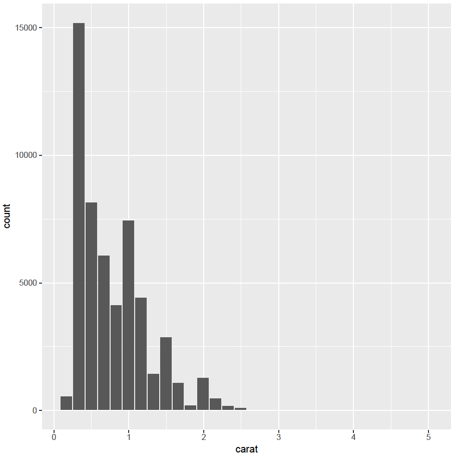
A good example of a single dimensional plot is a histogram (for continuous data). To create a histogram (geometric element) of the carat variable (aesthetic element) in the diamond data frame (source):
Single command method:
ggplot(diamonds, aes(x = carat)) + geom_histogram()
Will create the following plot with default bin width (this can be altered by changing the bin width or the number of bins allowed with the geometric element):
Please note that, when commands are entered in the console, the different options and their default values are displayed by R.
Additive method:
The same plot can be created by saving the first command as an R object and subsequently adding to it. This method can be useful if you are building plot a plot step by step:
my_plot <- ggplot(diamonds, aes(x = carat))
my_plot <- my_plot + geom_histogram()
my_plot
This will create the same plot. For brevity, the single long command line method will be used in the remainder of this section.
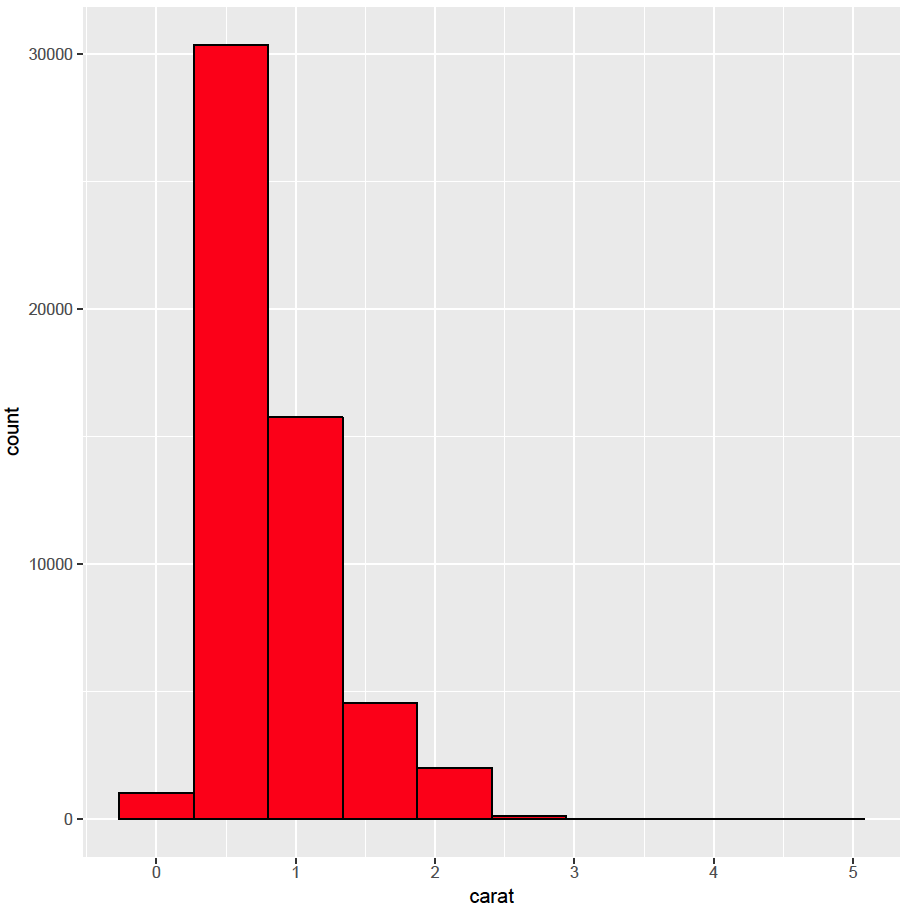
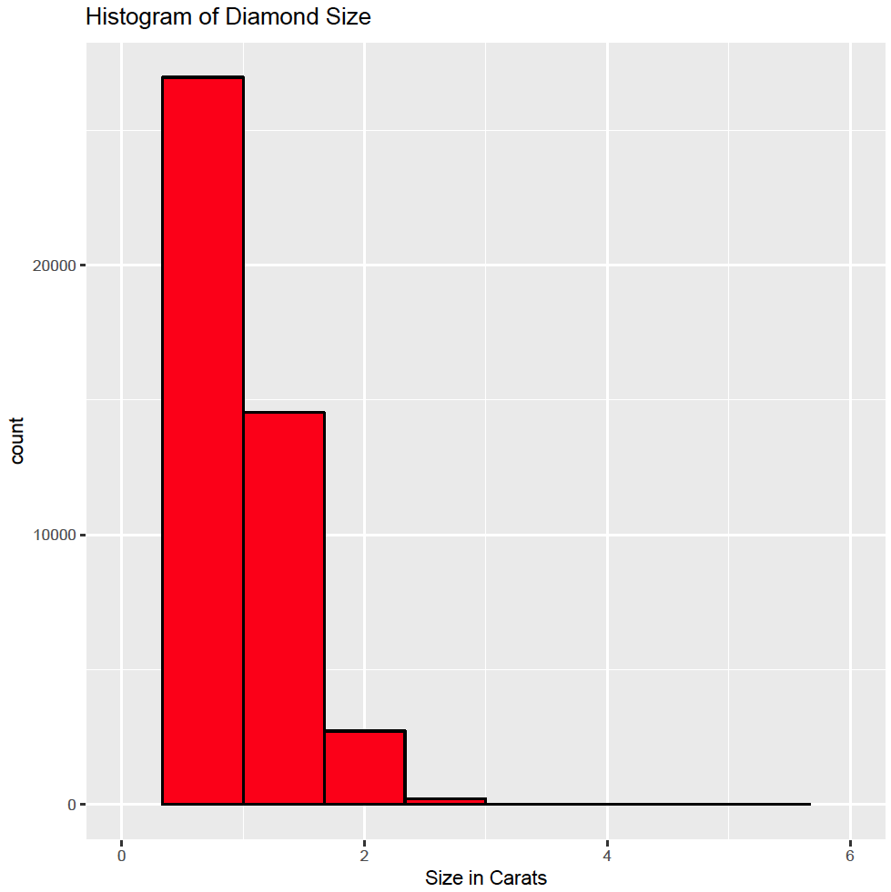
Each geometric element has different settings. Default settings are set automatically, but these can be altered within the geometric element call (please refer to the reference manual for a full description of each geometric element). For example, to reduce the numbers of bins to 10 (bins = 10), the outline colour to black (colour = “black”) and fill colour to red (fill = “red”):
ggplot(diamonds, aes(x = carat)) + geom_histogram(bins = 10, colour = “black”, fill = “red”)
Multi dimensional plot
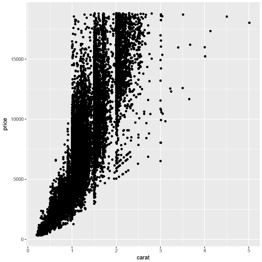
A scatter plot has two dimensions, one for the x axis and one for the y axis. Using the same rules, it is easy to create a scatter plot with the carat variable on the x axis and the price variable on the y axis:
ggplot(diamonds, aes(x = carat, y = price)) + geom_point()
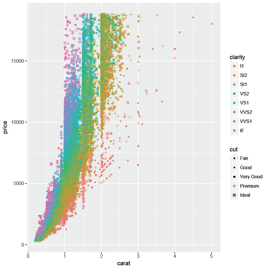
It is also straight forward to add further dimensions by adding these to the aesthetic element. For example, the categorical variable clarity can be mapped to the colour of the points to demonstrate the influence of clarity on price:
ggplot(diamonds, aes(x = carat, y = price, colour = clarity)) + geom_point()
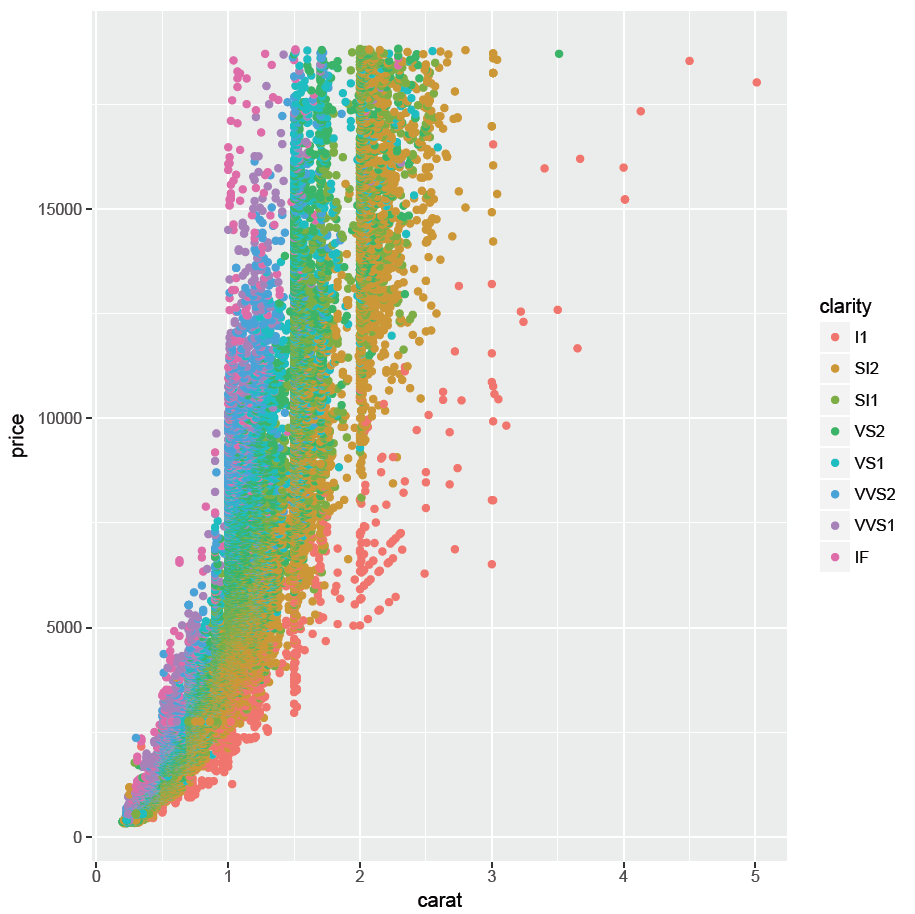
Please note a legend is automatically added.
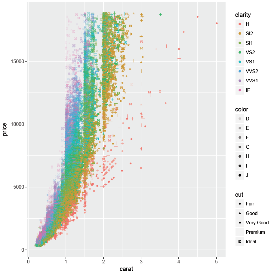
In addition, the shape of the point can be mapped to the categorical variable cut:
ggplot(diamonds, aes(x = carat, y = price, colour = clarity, shape = cut)) + geom_point()
The color variable can be mapped to the transparency (alpha) to create a transparency scale:
ggplot(diamonds, aes(x = carat, y = price, colour = clarity, shape = cut, alpha = color)) + geom_point()
It is also possible to map continuous variables to an aesthetic element. For example map the to depth to the size of the points in the scatter plot:
ggplot(diamonds, aes(x = carat, y = price, colour = clarity, shape = cut, alpha = color, size = depth)) + geom_point()
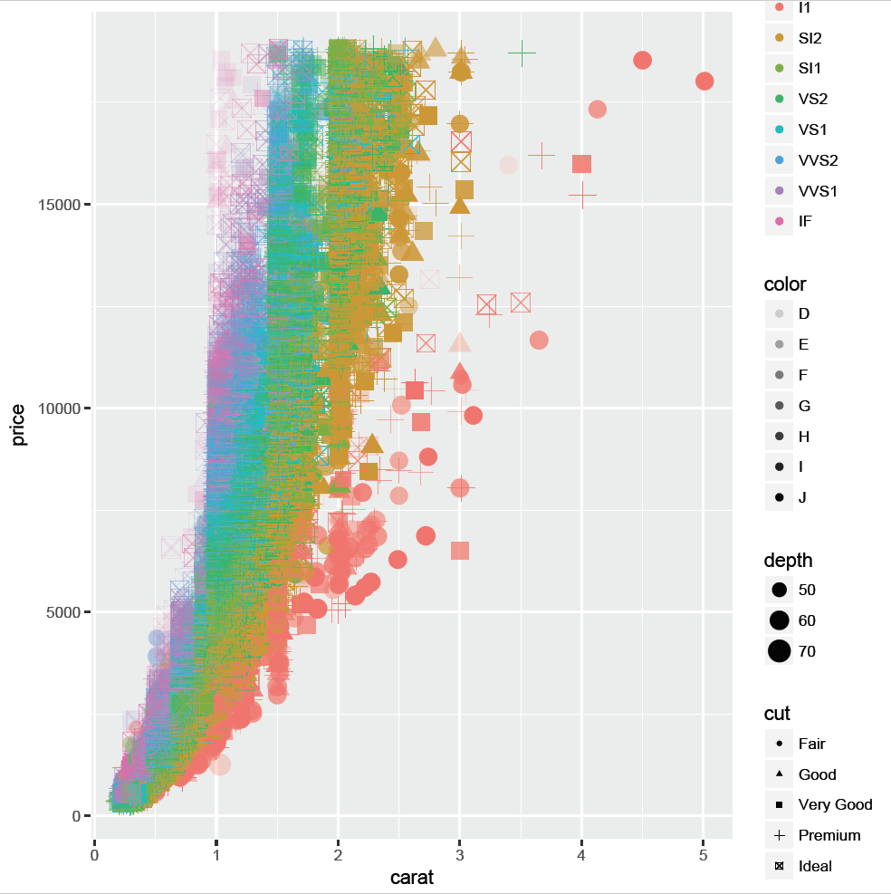
Although it is possible to add all these dimension to a plot, it makes it difficult to interpret and this is discouraged. It is better to keep the plots simple!
Combining variables in a single plot
It is common practice to declare the source data frame and aesthetics in the ggplot() function call, but this is not essential. Data source and variables can also be declared within the geometric element. For example, the histogram above could also be created by entering:
ggplot() + geom_histogram(data = diamonds, aes(x = carat), bins = 10, colour = “black”, fill = “red”)
This instruction is identical to:
ggplot(diamonds, aes(x = carat)) + geom_histogram(bins = 10, colour = “black”, fill = “red”)
Declaring the source and aesthetic elements within the geometric element will allow the addition of different data sources within the same plot. For example, to create a histogram of the carat variable and price variable in the same plot:
ggplot() + geom_histogram(data = diamonds, aes(x = carat), colour = “black”, fill = “red”) + geom_histogram(data = diamonds, aes(x = price), colour = “black”, fill = “green”)

As can be seen, the range of the price variable is considerably larger than the range of the carat variable. Automatic axis scaling displays all data. Consequently, there is only one bin for the carat variable. Furthermore, there are no free diamonds and the price variable has no bin at zero. To display both histograms in the same plot, the carat variable can be scaled to similar magnitude as the price variable (multiplied by 10,000):
ggplot() + geom_histogram(data = diamonds, aes(x = carat * 10000), colour = “black”, fill = “red”, alpha = 0.5) + geom_histogram(data = diamonds, aes(x = price), colour = “black”, fill = “green”, alpha = 0.5)

Please note the transparency has been set to 50% (alpha = 0.5) to display overlapping histograms.
Please note the x axis label displays the name of the variable in the first histogram create (carat*10000). The label on the x axis can be changed by adding an axis layer (see below).
Further examples of different plots and how to create them is described in the plots section.
Adding layers
Once the basic plot is displayed, layers can be added to add a title or change an axis. It is impossible to name all the possibilities, but please refer to the reference manual for further information. Going back to the histogram created above, it is easy to add a title:
ggplot(diamonds, aes(x = carat)) + geom_histogram(bins = 10, colour = “black”, fill = “red”) + ggtitle(“Histogram of Diamond Size”)
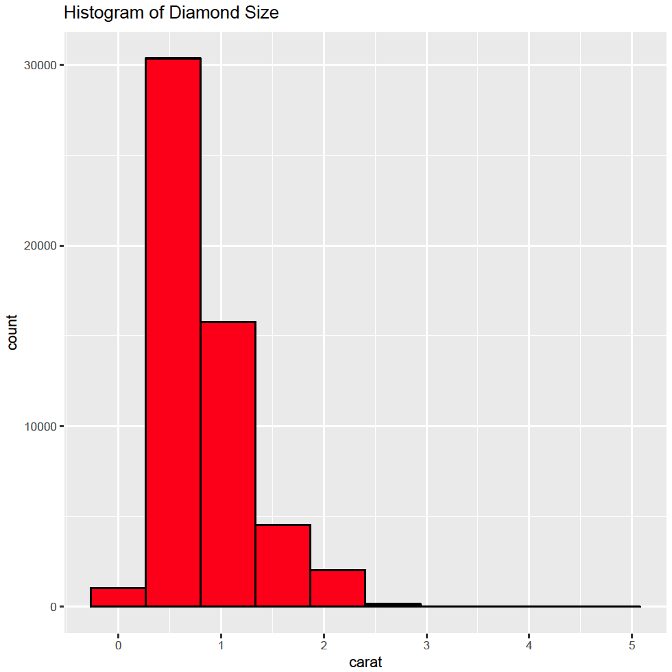
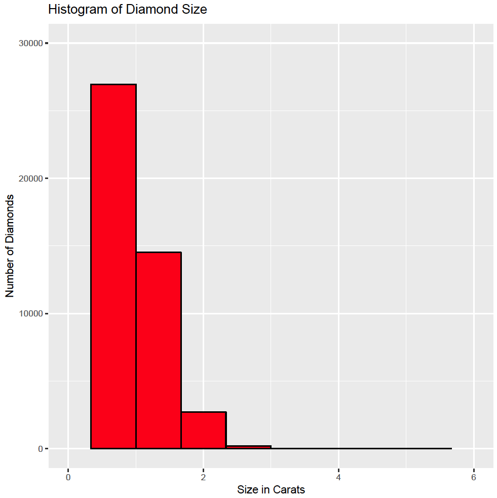
and change the x axis:
ggplot(diamonds, aes(x = carat)) + geom_histogram(bins = 10, colour = “black”, fill = “red”) + ggtitle(“Histogram of Diamond Size”) + scale_x_continuous(“Size in Carats”, limits = c(0, 6))
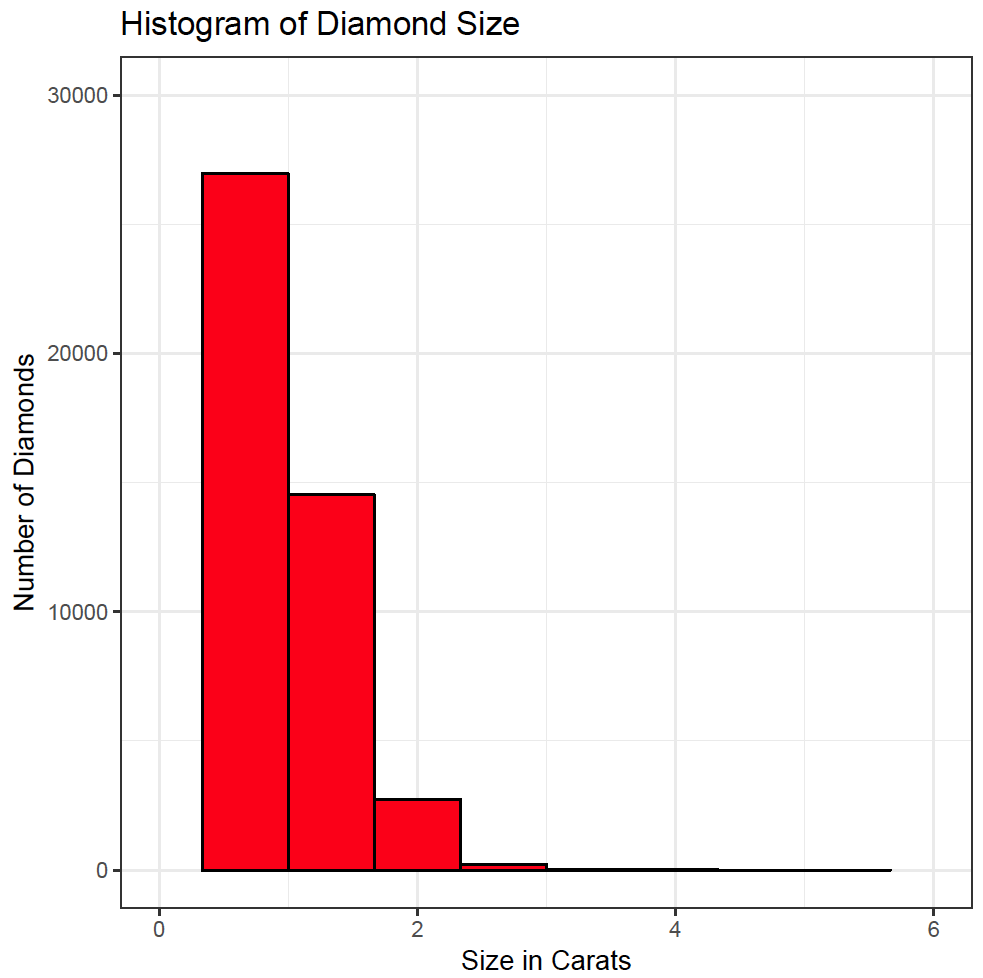
and the y axis:
ggplot(diamonds, aes(x = carat)) + geom_histogram(bins = 10, colour = “black”, fill = “red”) + ggtitle(“Histogram of Diamond Size”) + scale_x_continuous(“Size in Carats”, limits = c(0, 6)) + scale_y_continuous(“Number of Diamonds”, limits = c(0, 30000))
Themes
The ggplot package also contains themes to allow the creation of different plots with the same lay out. For example, the black and white theme can be used to create plots suitable for publication:
ggplot(diamonds, aes(x = carat)) + geom_histogram(bins = 10, colour = “black”, fill = “red”) + ggtitle(“Histogram of Diamond Size”) + scale_x_continuous(“Size in Carats”, limits = c(0, 6)) + scale_y_continuous(“Number of Diamonds”, limits = c(0, 30000)) + theme_bw(base_size = 14, base_family = “Arial”)
Please note the font and font size can be set in the theme call.
The plots created above have automatically the default ggplot theme applied to them. Although the plots look good, they are instantly recognisable as being created by the ggplot package. Authors may want to create their own theme. This is described in the themes section.