Cox proportional hazards is regression modelling on a survival object with one or more predictor variables. Central to the analysis is the baseline hazard function. The Cox model assumes that the hazard of a predictor is constant over time and stays proportionally the same in relation to other predictors.
This example uses the veteran dataset that is part of the survival package 1. In addition, the ggfortify package 2 is used to allow unified plotting in conjunction with the ggplot2 package 3. The autoplot() function of ggfortify can be extended with ggplot2 calls (illustrated below).
load the libraries:
library(ggfortify)
Loading required package: ggplot2
library(survival)
Load the veteran data set of the survival package, that contains data from a two treatments randomised controlled trial in lung cancer:
data(veteran)
veteran
trt celltype time status karno diagtime age prior
1 1 squamous 72 1 60 7 69 0
2 1 squamous 411 1 70 5 64 10
3 1 squamous 228 1 60 3 38 0
– – –
137 2 large 49 1 30 3 37 0
str(veteran)
‘data.frame': 137 obs. of 8 variables:
$ trt : num 1 1 1 1 1 1 1 1 1 1 …
$ celltype: Factor w/ 4 levels “squamous”,”smallcell”,..: 1 1 1 1 1 1 1 1 1 1 …
$ time : num 72 411 228 126 118 10 82 110 314 100 …
$ status : num 1 1 1 1 1 1 1 1 1 0 …
$ karno : num 60 70 60 60 70 20 40 80 50 70 …
$ diagtime: num 7 5 3 9 11 5 10 29 18 6 …
$ age : num 69 64 38 63 65 49 69 68 43 70 …
$ prior : num 0 10 0 10 10 0 10 0 0 0 …
- trt (treatment): 1 = standard, 2 = test
- celltype: factor, 1 = squamous, 2 = small cell, 3 = adeno, 4 = large
- time: survival time in days
- status: censoring status
- karno: Karnofsky performance status
- diagtime: months from diagnosis to randomisation
- age: age in years
- prior: prior therapy: 0 = no, 10 = yes
Cox proportional hazards analysis
Fit a Cox regression model to the data:
veteran_cox <- coxph(Surv(time, status) ~ trt + celltype + karno + diagtime + age + prior, data = veteran)
summary(veteran_cox)
Call:
coxph(formula = Surv(time, status) ~ trt + celltype + karno +
diagtime + age + prior, data = veteran)
n= 137, number of events= 128
coef exp(coef) se(coef) z Pr(>|z|)
trt 2.946e-01 1.343e+00 2.075e-01 1.419 0.15577
celltypesmallcell 8.616e-01 2.367e+00 2.753e-01 3.130 0.00175 **
celltypeadeno 1.196e+00 3.307e+00 3.009e-01 3.975 7.05e-05 ***
celltypelarge 4.013e-01 1.494e+00 2.827e-01 1.420 0.15574
karno -3.282e-02 9.677e-01 5.508e-03 -5.958 2.55e-09 ***
diagtime 8.132e-05 1.000e+00 9.136e-03 0.009 0.99290
age -8.706e-03 9.913e-01 9.300e-03 -0.936 0.34920
prior 7.159e-03 1.007e+00 2.323e-02 0.308 0.75794
—
Signif. codes: 0 ‘***’ 0.001 ‘**’ 0.01 ‘*’ 0.05 ‘.’ 0.1 ‘ ’ 1
exp(coef) exp(-coef) lower .95 upper .95
trt 1.3426 0.7448 0.8939 2.0166
celltypesmallcell 2.3669 0.4225 1.3799 4.0597
celltypeadeno 3.3071 0.3024 1.8336 5.9647
celltypelarge 1.4938 0.6695 0.8583 2.5996
karno 0.9677 1.0334 0.9573 0.9782
diagtime 1.0001 0.9999 0.9823 1.0182
age 0.9913 1.0087 0.9734 1.0096
prior 1.0072 0.9929 0.9624 1.0541
Concordance= 0.736 (se = 0.03 )
Rsquare= 0.364 (max possible= 0.999 )
Likelihood ratio test= 62.1 on 8 df, p=1.799e-10
Wald test = 62.37 on 8 df, p=1.596e-10
Score (logrank) test = 66.74 on 8 df, p=2.186e-11
The model shows that small cell tumours, adenocarcinomas and Karnofsky scores to be significant (p values significant and 1 outside the 95% confidence interval). However, the result should be interpreted with caution as the Cox model assumes that the hazard of the predictors do not vary with time and this may not be the case (ie Karnofsky score).
Adenocarcinomas and Small cell tumours have a positive coefficient (higher hazard; hazard ratio 2.37 for small cell and 3.31 for adeno carcinomas), suggesting a worse survival as compared to squamous carcinomas (the reference level). The Karnofsky score has a negative coefficient (lower hazard with higher scores and a harzard ratio of 0.97) (suggesting a better survival with higher Karnofsky scores).
To show the Cox survival curve, combine ggfortify’s autoplot() function with ggplot() calls:
veteran_cox_fit <- survfit(veteran_cox)
autoplot(veteran_cox_fit) + theme_bw() + ggtitle(“Cox Proportional Hazards – veteran data”) + xlab(“Time [days]”) + ylab(“Survival Probability [%]”)

However, this prediction curve is based on the mean value of the covariates (default). It is also possible to display the estimated survival depending on certain covariates. To do this, it is necessary to create a new data frame that is passed to survfit. Unfortunately, ggfortify’s autoplot() function doesn’t plot the curves, but the survminer 4 package can produce them.
For example, to create Cox proportional hazard curves for the different cell types, create a data frame (celltypes_df) with the values to be used. It is essential the variables have the same name and type (factor / numerical) as the data frame used for the modelling and that all variables are included. The above model has 6 predictor variables (trt, celltype, karno, diagtime, age and prior). Create a new data frame called
celltypes_df <- with(veteran, data.frame(celltype = c(“squamous”, “smallcell”, “adeno”, “large”), trt = rep(mean(trt), 4), karno = rep(mean(karno), 4), diagtime = rep(mean(diagtime), 4), age = rep(mean(age), 4), prior = rep(mean(prior), 4)))
celltypes_df
celltype trt karno diagtime age prior
1 squamous 1.49635 58.56934 8.773723 58.30657 2.919708
2 smallcell 1.49635 58.56934 8.773723 58.30657 2.919708
3 adeno 1.49635 58.56934 8.773723 58.30657 2.919708
4 large 1.49635 58.56934 8.773723 58.30657 2.919708
Check the structure (str()) of the data frame, to confirm the variables are of the correct type:
str(celltypes_df)
‘data.frame': 4 obs. of 6 variables:
$ celltype: Factor w/ 4 levels “adeno”,”large”,..: 4 3 1 2
$ trt : num 1.5 1.5 1.5 1.5
$ karno : num 58.6 58.6 58.6 58.6
$ diagtime: num 8.77 8.77 8.77 8.77
$ age : num 58.3 58.3 58.3 58.3
$ prior : num 2.92 2.92 2.92 2.92
Behind the scenes, R codes factors as integer numbers. The levels of the original data frame can be seen by:
levels(veteran$celltype)
[1] “squamous” “smallcell” “adeno” “large”
And of the new data frame:
levels(celltypes_df$celltype)
[1] “adeno” “large” “smallcell” “squamous”
The levels have a different order, but are otherwise the same.
Now fit the new data to the model:
celltypes_veteran_cox_fit <- survfit(veteran_cox, newdata = celltypes_df)
Unfortunately, the autoplot() function doesn’t support the new data:
autoplot(celltypes_veteran_cox_fit)
Error in rbind(deparse.level, …) :
numbers of columns of arguments do not match
But, the survminer package 4 does:
library(survminer)
ggsurvplot(celltypes_veteran_cox_fit, conf.int = TRUE, ggtheme = theme_bw())
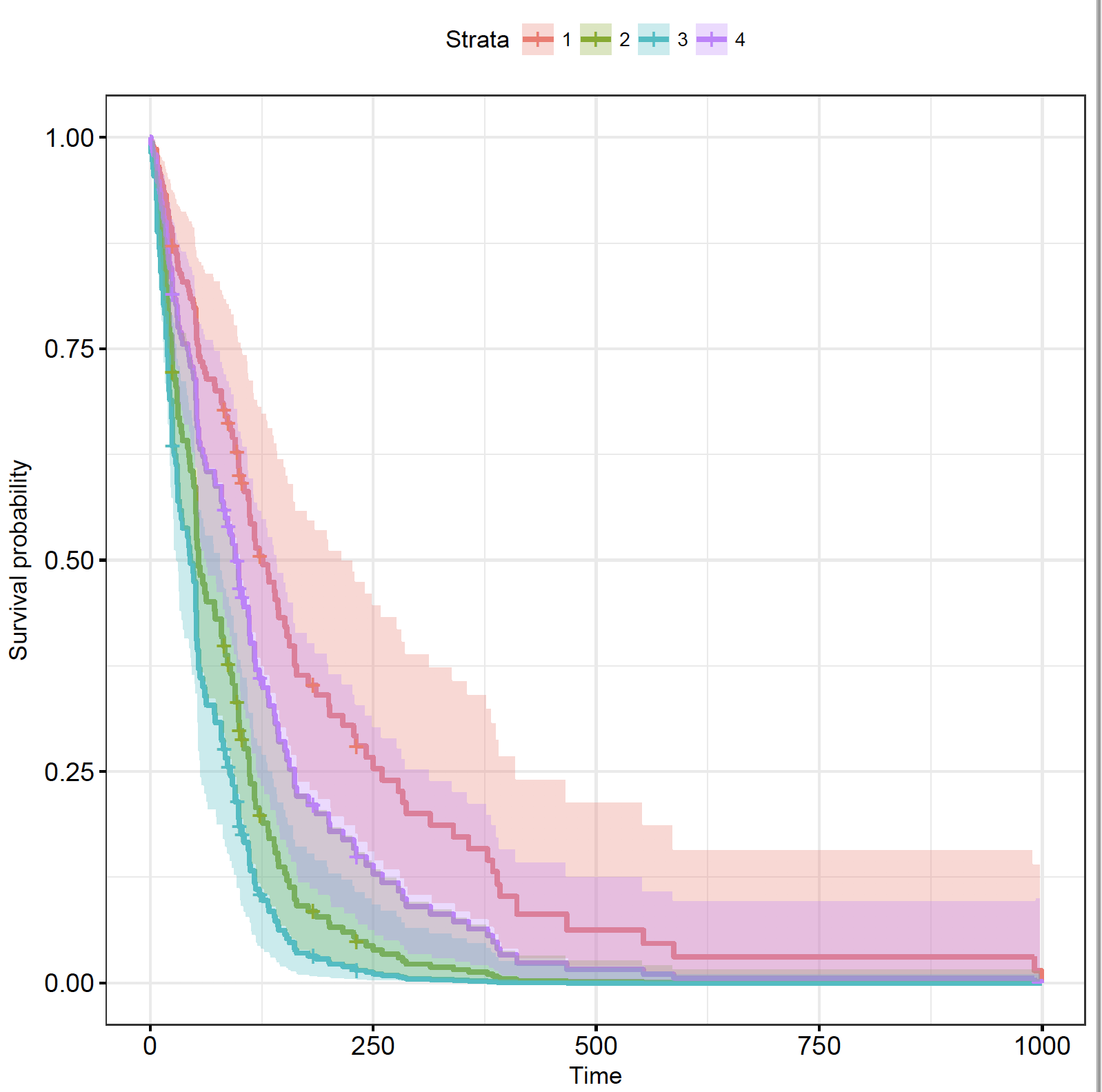
The plot shows the 4 strata as a number, but which one is which? Set the levels the same as the order of the factor levels in the original (veteran) data frame in the legend of the plot:
ggsurvplot(celltypes_veteran_cox_fit, conf.int = TRUE, ggtheme = theme_bw(), legend.labs = levels(veteran$celltype))

As described in the model, compared to squamous cell carcinoma, small cell and adeno-carcinomas are significantly worse, but the confidence interval of large cell tumours overlaps.
Similarly, define a custom dataframe:
custom_df <- with(veteran, data.frame(celltype = “adeno”, trt = 1, karno = 50, diagtime = mean(diagtime), age = 80, prior = 0))
custom_df
celltype trt karno diagtime age prior
1 adeno 1 50 8.773723 80 0
custom_cox_fit <-survfit(veteran_cox, newdata = custom_df)
autoplot(custom_cox_fit) + theme_bw() + ggtitle(“Cox Proportional Hazards – Custom Veteran Data”) + xlab(“Time [days]”) + ylab(“Survival Probability [%]”)
