Rather than creating static plots that can be printed on paper, it is also possible to create interactive plots for publication on a web site. The user can than interact with the plot for example to zoom in or change parameters.
For example, the time series plot could be saved to a web page as an interactive plot, using the use the plotly package 1.
The easiest way to create an interactive plot is to first create the plot using ggplot2 2 and then convert it to an interactive plot with the plotly 1.
1: Create the plot
The data set temp contains the daily temperature and dew point. It contains three variables: Date, temp and dewpoint. Once loaded into R, the data frame can be viewed:
> temp
temp dewpoint Date
1 11.9 7.1 2015-05-11
2 14.2 4.7 2015-05-12
3 14.2 4.7 2015-05-12
— omitted for brevity
The individual variables can be addressed:
> temp$Date
> temp$temp
> temp$dewpoint
To create a time series of the temperature and the dew point, first make sure the ggplot2 2 and scales 3 libraries are loaded:
library(ggplot2)
library(scales) # to access breaks/formatting functions
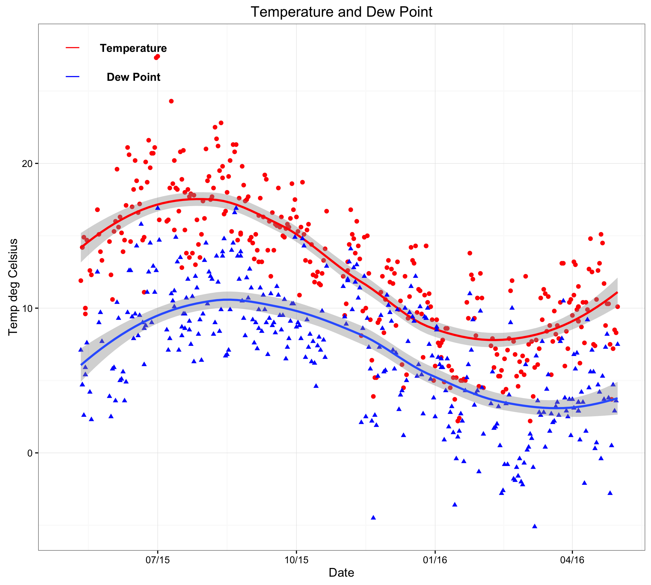
Now create a new window (dev.new()), use the ggplot library, apply a black and white theme, show data points and fit a smooth trend line (red for temp and blue for dewpoint). Following this, create a title and appropriate axes labels. When adding annotations, it is necessary to address the coordinates of the x-axis as a date (rather than a number or string). Finally, format the date axis as appropriate (here 3 monthly):
dev.new()
ggplot() +
theme_bw() +
geom_point(aes(x = Date,y = temp),data=temp,colour = ‘#ff0000′) +
geom_smooth(aes(x = Date,y = temp),data=temp,colour = ‘#ff0000′,method = ‘loess’) +
geom_point(aes(x = Date,y = dewpoint),data=temp,shape = 17,colour = ‘#0000ff’) +
geom_smooth(aes(x = Date,y = dewpoint),data=temp,method = ‘loess’) +
ggtitle(label = ‘Temperature and Dew Point’) +
ylab(label = ‘Temp deg Celsius’) +
xlab(label = ‘Date’) +
annotate(geom=’text’,x=as.Date(‘2015-06-15′),y=28,label= ‘Temperature’,fontface= ‘bold’)+
annotate(geom=’text’,x=as.Date(‘2015-06-15′),y=26,label= ‘Dew Point’,fontface= ‘bold’)+
annotate(‘segment’,x=as.Date(‘2015-05-01′),xend=as.Date(‘2015-05-10′),y=28,yend=28,colour=’red’) +
annotate(‘segment’,x=as.Date(‘2015-05-01′),xend=as.Date(‘2015-05-10′),y=26,yend=26,colour=’blue’) +
scale_x_date(labels = date_format(‘%m/%y’),breaks=date_breaks(‘3 months’)) # this scales the x axis.
Please note that the code can be copied and pasted into the console. However, it may be necessary to change the quotation marks as it can cause errors.
2: Convert to an interactive plot
The above plot can now be converted to an interactive plot with the plotly package 1.
Define the plot as an object and give it a name (ie temp_plot).
temp_plot <- ggplot() +
theme_bw() +
geom_point(aes(x = Date,y = temp),data=temp,colour = ‘#ff0000′) +
geom_smooth(aes(x = Date,y = temp),data=temp,colour = ‘#ff0000′,method = ‘loess’) +
geom_point(aes(x = Date,y = dewpoint),data=temp,shape = 17,colour = ‘#0000ff’) +
geom_smooth(aes(x = Date,y = dewpoint),data=temp,method = ‘loess’) +
ggtitle(label = ‘Temperature and Dew Point’) +
ylab(label = ‘Temp deg Celsius’) +
xlab(label = ‘Date’) +
annotate(geom=’text’,x=as.Date(‘2015-06-15′),y=28,label= ‘Temperature’,fontface= ‘bold’)+
annotate(geom=’text’,x=as.Date(‘2015-06-15′),y=26,label= ‘Dew Point’,fontface= ‘bold’)+
annotate(‘segment’,x=as.Date(‘2015-05-01′),xend=as.Date(‘2015-05-10′),y=28,yend=28,colour=’red’) +
annotate(‘segment’,x=as.Date(‘2015-05-01′),xend=as.Date(‘2015-05-10′),y=26,yend=26,colour=’blue’) +
scale_x_date(labels = date_format(‘%m/%y’),breaks=date_breaks(‘3 months’)) # this scales the x axis.
Please note that the code can be copied and pasted into the console. However, it may be necessary to change the quotation marks as it can cause errors.
The plot will now show but will be stored as an object. To show the plot is R, simple enter:
temp_plot
(plot already shown above).
The plotly package 1 should be installed.
library(plotly)
ggplotly(temp_plot)
The plot should now appear in your web browser. The folder that contains the files to create the plot is shown in the address bar of your browser. This folder will be deleted when you close R, so leave R open. Go to the folder shown in the address bar of your browser and copy the folder with all its subfolders and paste it to your web server. Set up a link and the plot should be available on your server: