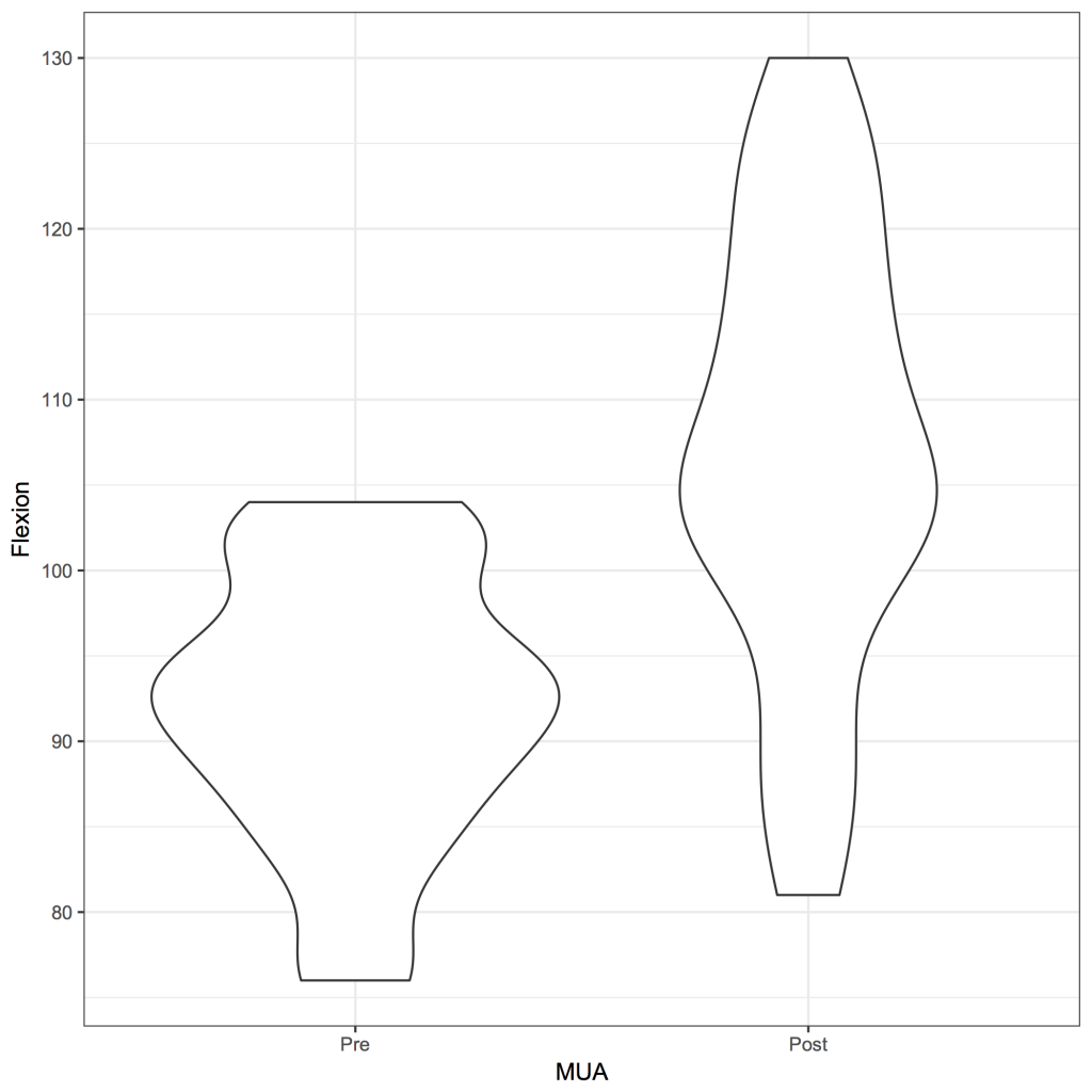
A violin plot is essentially a box and whisker plot where the distribution of the data is represented by a violin (the distribution curve) rather than a box. Therefore, the violin plot gives more information about the distribution of the data than a box and whisker plot. The plot is created with the ggplot2 package 1 .
Download and open the strip.rda dataset for this example and open it in R / JGR. The data set contains the maximum flexion in 20 patients before and after a manipulation under anaesthesia. The data can be shown by:
strip
Flexion MUA
1 94 Pre
2 95 Pre
3 89 Pre
–
–
39 113 Post
40 86 Post
To create a simple violin plot:
library(ggplot2)
ggplot(strip, aes(x = MUA, y = Flexion)) + geom_violin() + theme_bw() + scale_x_discrete(limits = c(‘Pre’, ‘Post’))
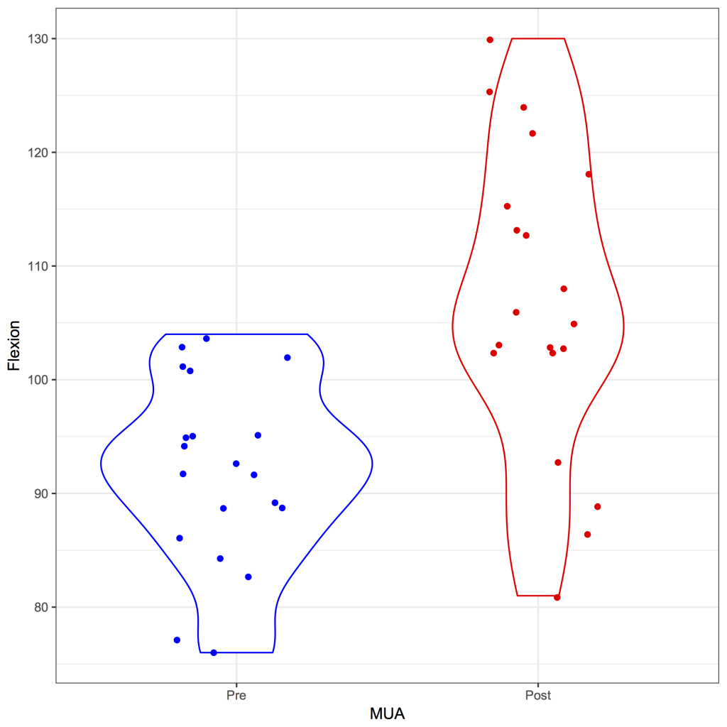
Of course, it is possible to give the different groups a colour, change the order on the x-axis, remove the legend and add the data points:
library(ggplot2)
ggplot(strip, aes(x = MUA, y = Flexion, color = MUA)) + geom_violin() + theme_bw() + scale_x_discrete(limits = c(‘Pre’, ‘Post’)) + theme(legend.position = ‘none’) + scale_color_manual(values = c(‘red’, ‘blue’)) + geom_jitter(position = position_jitter(0.2))
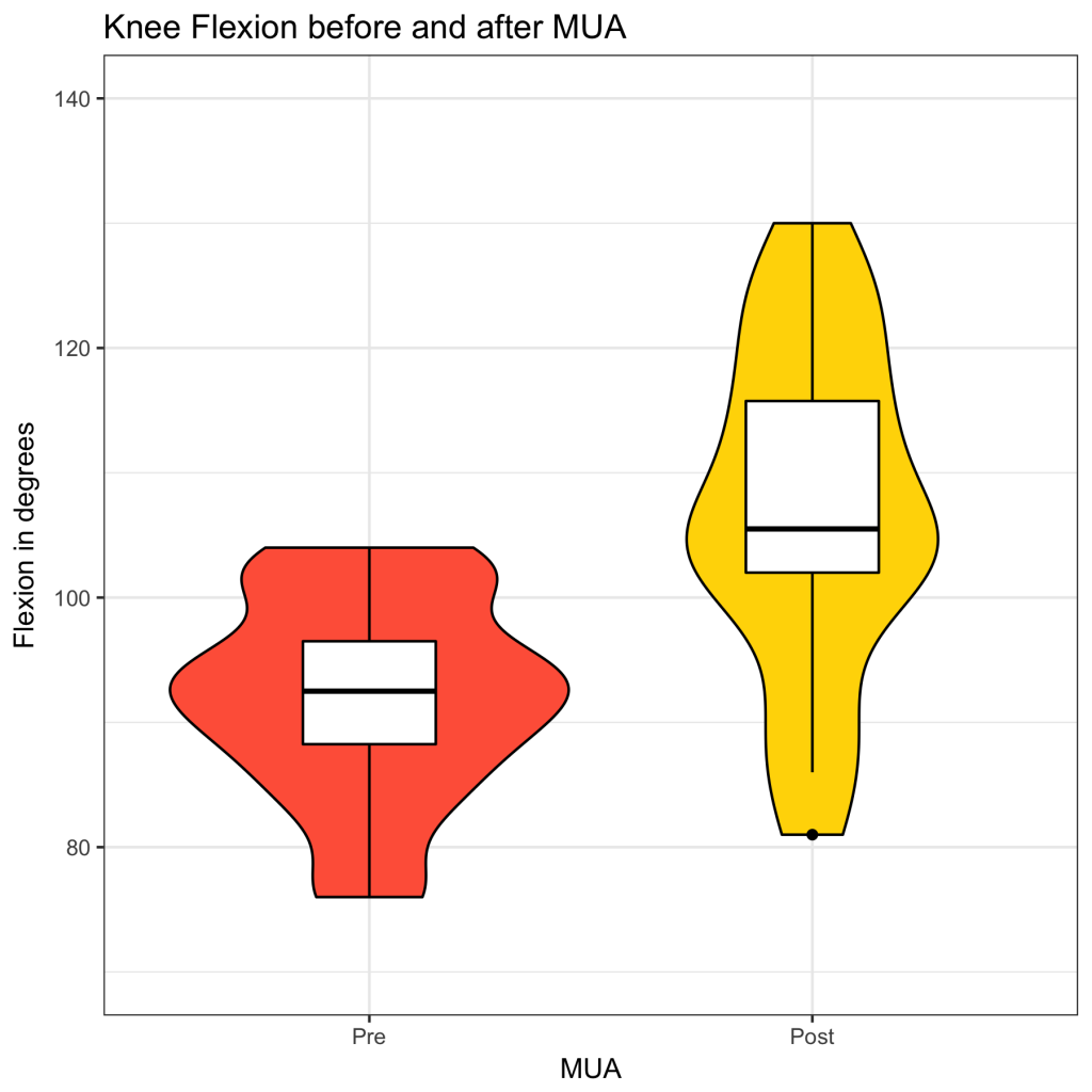
A standard violin plot doesn’t include a median value and a box representing the interquartile range. However, it is quite straightforward to add a box and whisker plot to the plot:
library(ggplot2)
ggplot(strip, aes(x = MUA, y = Flexion, color = MUA)) +
geom_violin(aes(fill = MUA), color = ‘black’) +
geom_boxplot(width = 0.3, colour = ‘black’) +
ggtitle(‘Knee Flexion before and after MUA’) +
scale_x_discrete(limits = c(‘Pre’, ‘Post’)) +
scale_y_continuous(limits = c(70,140), ‘Flexion in degrees’) +
scale_fill_manual(values = c(‘gold’,’tomato’)) +
theme_bw() +
theme(legend.position = ‘none’)
If so desired, the mean can also be added (as a diamond shape), so that maxmimum information about the data can be displayed in one plot; with a visible mean, median and mode(s):
library(ggplot2)
ggplot(strip, aes(x = MUA, y = Flexion, color = MUA)) +
geom_violin(aes(fill = MUA), color = ‘black’) +
geom_boxplot(width = 0.3, colour = ‘black’) +
ggtitle(‘Knee Flexion before and after MUA’) +
scale_x_discrete(limits = c(‘Pre’, ‘Post’)) +
scale_y_continuous(limits = c(70,140), ‘Flexion in degrees’) +
scale_fill_manual(values = c(‘gold’,’tomato’)) +
theme_bw() +
theme(legend.position = ‘none’) +
stat_summary(fun.y = mean, geom = ‘point’, shape = 23, size = 4, color = ‘black’)


