Sometimes it is useful to display a variable over time. This example shows how to create a time series using the ggplot2 1 library.
The data set temp contains the daily temperature and dew point. It contains three variables: Date, temp and dewpoint. Once loaded into R, the data frame can be viewed:
> temp
temp dewpoint Date
1 11.9 7.1 2015-05-11
2 14.2 4.7 2015-05-12
3 14.2 4.7 2015-05-12
— omitted for brevity
The individual variables can be addressed:
> temp$Date
> temp$temp
> temp$dewpoint
To create a time series of the temperature and the dew point, first make sure the ggplot2 1 and scales 2 libraries are loaded:
library(ggplot2)
library(scales) # to access breaks/formatting functions
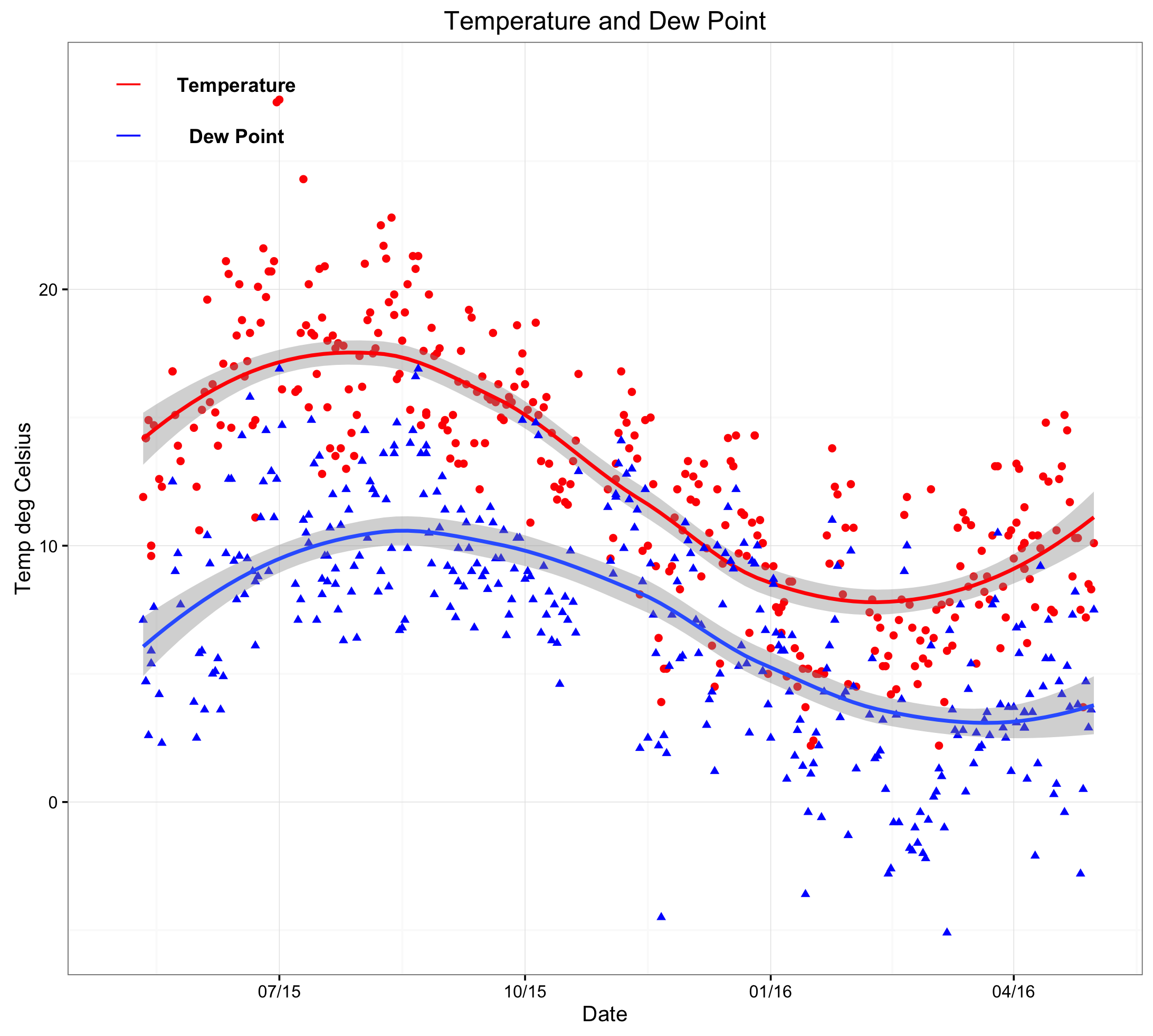
Now create a new window (dev.new()), use the ggplot library, apply a black and white theme, show data points and fit a smooth trend line (red for temp and blue for dewpoint). Following this, create a title and appropriate axes labels. When adding annotations, it is necessary to address the coordinates of the x-axis as a date (rather than a number or string). Finally, format the date axis as appropriate (here 3 monthly):
dev.new()
ggplot() +
theme_bw() +
geom_point(aes(x = Date,y = temp),data=temp,colour = ‘#ff0000′) +
geom_smooth(aes(x = Date,y = temp),data=temp,colour = ‘#ff0000′,method = ‘loess’) +
geom_point(aes(x = Date,y = dewpoint),data=temp,shape = 17,colour = ‘#0000ff’) +
geom_smooth(aes(x = Date,y = dewpoint),data=temp,method = ‘loess’) +
ggtitle(label = ‘Temperature and Dew Point’) +
ylab(label = ‘Temp deg Celsius’) +
xlab(label = ‘Date’) +
annotate(geom=’text’,x=as.Date(‘2015-06-15′),y=28,label= ‘Temperature’,fontface= ‘bold’)+
annotate(geom=’text’,x=as.Date(‘2015-06-15′),y=26,label= ‘Dew Point’,fontface= ‘bold’)+
annotate(‘segment’,x=as.Date(‘2015-05-01′),xend=as.Date(‘2015-05-10′),y=28,yend=28,colour=’red’) +
annotate(‘segment’,x=as.Date(‘2015-05-01′),xend=as.Date(‘2015-05-10′),y=26,yend=26,colour=’blue’) +
scale_x_date(labels = date_format(‘%m/%y’),breaks=date_breaks(‘3 months’)) # this scales the x axis.
Please note that the code can be copied and pasted into the console. However, it may be necessary to change the quotation marks as it can cause errors.